Blog

  • Temporary Shop Signage: What to Use for Pop-Ups, Sales & Store Openings

    Temporary Shop Signage: What to Use for Pop-Ups, Sales & Store Openings

    Temporary Signage: What to Use for Pop-Ups, Sales & Store Openings

    A shop doesn’t always need a permanent fascia to get noticed. When you are launching a pop-up, running a clearance sale or hosting events, temporary signage lets you announce your news quickly, with no long-term commitment.

    Temporary signage covers printed banners, A-frames, window graphics, floor graphics and boards that do a short term job, such as announcing a pop-up, a sale or a store opening.

    Choose the right materials for the environment. Lightweight board is fine indoors, but outdoor temporary signs need weather-resistant faces and secure fixings. Keep your brand identity consistent, using the same colours, fonts and logo as your permanent shop, so customers recognise the business.

    Done well, temporary signs stand out on a busy London high street or in a quiet market town, and they bring customers through the door while your offer is still live.

    This complete guide explains which temporary signs suit each job, how to choose the right materials, and where event signs and construction signs fit in. It also covers keeping costs sensible and the rules that apply once signage goes up outdoors. If you want the bigger picture on permanent signage first, our guide to choosing the perfect shop signage in the UK is a useful companion.

    Which Temporary Signs Work Best for Pop-Ups, Sales and Store Openings?

    A temporary sign has one job: to communicate a short term message to people who will only glance at it. That message might be “Now open”, “Everything half price” or “Pop-up ends Sunday”. In the real-world rush of a high street, shoppers give signage a second or two, so every business should adapt the format to the site, the budget and how long the sign must last.

    Temporary signage is ideal for promotions lasting up to three months, after which a refreshed message or a permanent solution usually makes more sense. Manchester signs center designs and manufactures temporary signage in-house, ensuring your message is clear, on-brand and ready to install quickly.

    Occasion

    Useful temporary signs

    Typical location

    Pop-up shop

    Banners, A-frames, removable window vinyl

    Above or beside the entrance, and the window

    Sale or promotions

    Window posters, floor graphics, hanging signs, shelf-edge tickets

    Windows and shop floor

    Store opening

    Large banners, “coming soon” window graphics, directional signs Manchester signs center can supply all three, plus professional installation across the UK, so your store opening announcement reaches customers from every angle.

    Fascia, windows and the approach route

    Pop-Up Shops

    Pop-ups typically occupy a unit for days or weeks, so signage should be quick to install and easy to remove without marking the shopfront. A PVC banner above the unit, printed graphics on the glass and a freestanding A-frame cover most needs. You may be sharing a building or a market hall, so find out what the landlord permits before anything is installed.

    A small business with a short lease will also want signs that leave no trace once the pop-up closes.

    Pop-up shop displaying a temporary promotional banner, removable window graphics and an A-frame beside the entrance, with products visible inside.

    Sales and Promotions

    Promotions are about urgency. Bold colours, large numerals and a snappy slogan will be read far faster than a paragraph of small print. Keep each sign simple: the offer, the dates and one line of detail.

    Window posters and floor graphics work well for people already near the shop, while banners above the door catch those further down the street. A-frame signs are a strong choice here: they are portable, double-sided and effective for daily specials and directional guidance, so one board can be seen from both directions along the pavement.

    If your sale runs into the evening, think about how the signs look after dark. Our article on night visibility signage and illuminated signs that stand out after dark is a good place to start.

    Store Openings

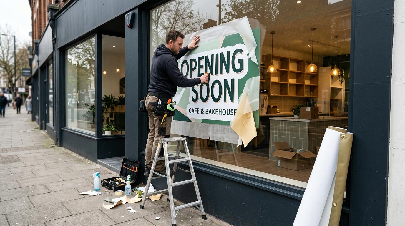
    A store opening deserves your strongest display, because it is the first impression a new location makes. Many retailers start with a “coming soon” window graphic to build interest, then add a large banner for opening week and hint at more news to come, with a date and a link to a social media page.

    Feather flags are worth considering too: they improve roadside visibility and work well for grand openings and outdoor markets, drawing the eye of drivers and walkers long before they reach the door. Use the same brand identity throughout, so that when the permanent signage is installed, customers recognise the shop at once.

    Consistent branding matters, as temporary signage can improve brand recognition by around 35%. For a complete opening, add directions from the nearest car park or station, so first-time visitors can find you without effort.

    For the official guidance, see Planning permission – Adverts and signs – Planning Portal.

    How Do You Choose the Right Materials for Temporary Signage?

    The right materials depend on three things: where the sign will be, how long it must last and how much wind and rain it will face. A sign for a sheltered window is a very different job from a banner on an exposed fascia.

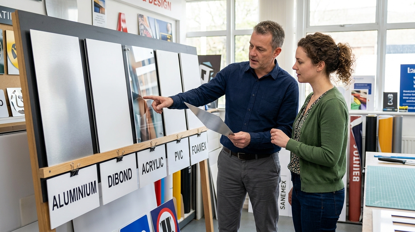
    Permanent signs are usually made from robust materials such as metal, whereas temporary signage deliberately uses lighter, lower cost materials, which keeps manufacturing costs down and helps a modest budget go further. A wide range of materials is available for temporary signage, and these are the most common choices:

    • PVC banners: flexible and durable, and they hold vivid printed colours well. They suit outdoor use and can be fitted with eyelets for fixing.

    • Correx and other corrugated plastic boards: lightweight, durable and water-resistant, which makes Correx a dependable material for outdoor signs. Yard signs made of corrugated plastic are a favourite for real estate and local service promotions, and for post mounted and stake-mounted signs generally.

    • Foam board and card: low cost and crisp-looking, and light enough to hang using tape. Best kept indoors, as damp will soon spoil them, though foam board signs can last up to two years with proper care.

    • Self-adhesive vinyl: ideal for windows and floors. Ask for a removable adhesive if the sign must come off cleanly.

    • Rigid PVC or aluminium composite panels: a more durable option for temporary signs that must last several months outdoors.

    Fixings matter as much as the sign face. Cable ties are a quick, adjustable way to attach banners to railings or fencing, but use one at every eyelet and trim the ends so they don’t snag passers-by. Note that a solid banner acts like a sail in strong wind, so a mesh banner, or one with small wind slits, is often the safer choice.

    For post mounted boards, make sure the post is firmly set and the sign sits clear of paths and driveways. Once a sign is installed, give it a quick tug test to confirm every fixing is secure.

    Sustainability is worth weighing up when you choose materials. Correx is fully recyclable and is accepted in kerbside collection programmes in many areas, so using recyclable materials allows for environmentally sustainable disposal once the campaign ends. Check with your local council which plastics and boards it accepts before you bin a finished sign.

    Practical advice from the team that will supply your signs is valuable here. Describe where the sign will go and how long it will be up, then ask which materials suit the job and the weather. A supplier’s expertise can save you from buying a board that buckles in the first shower.

    If you are weighing up outdoor options, our guide to the best materials for outdoor weatherproof signage compares what holds up in British weather. Even short-lived signage benefits from a quick daily check, because a sagging corner or a faded panel undermines the professionalism of your brand. Our advice on outdoor shop sign maintenance is useful for maintaining signs in good order while they are up.

    Where Do Event Signs and Construction Signs Fit In?

    Event signs tell people that something is happening and how to reach it. Think launch parties, charity days, market weekends and community fairs.

    Event Signage

    For events like these, providing directions is the main job, so make the signs legible from a distance, with large lettering, strong contrast and clear arrows. Place the first sign where people must decide which way to turn, then repeat it at each junction or entrance. For events that run across several rooms or floors, add indoor wayfinding and safety notices so visitors are never left guessing which way to go.

    The format should be suited to the event:

    • A village fete may only need a few boards on stakes to direct visitors.

    • A product launch might call for banners, floor graphics and a branded entrance arch.

    • Estate agent signs are the familiar example: a large, simple board with one clear message and a contact number. The same discipline works for any short-lived shop promotion, and a printed board with a single clear message will always outperform a cluttered one.

    • If your events are held on a regular basis, such as monthly markets, durable boards that can be reused will save money over the season.

    Construction Signage

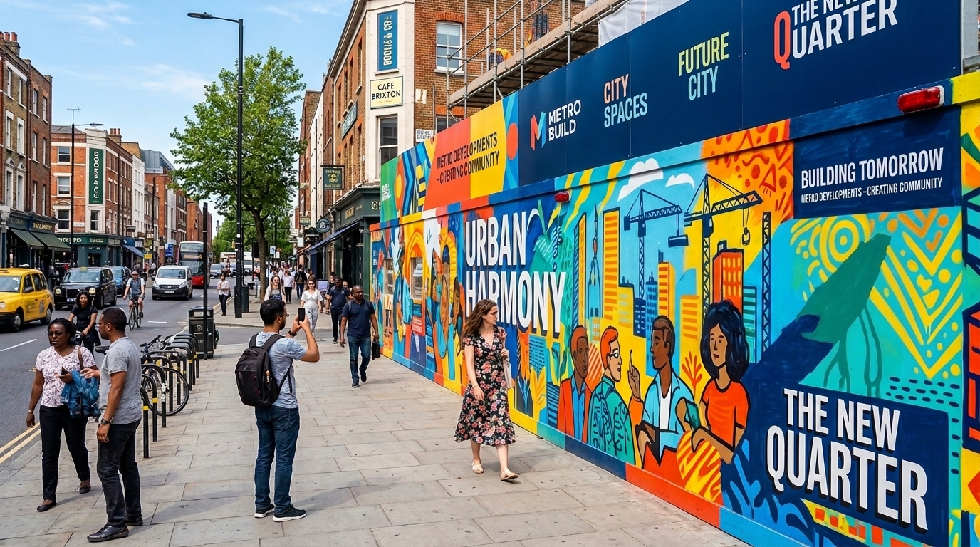
    If your new premises are being fitted out, hoardings and banners around construction sites tell passers-by what is coming and keep the frontage looking intentional. Many shops use construction signs of this kind as a “coming soon” teaser, with the shop name, an opening date and a website address. Because construction sites are busy, keep the artwork bold and simple.

    GOV.UK guidance states that large wrap advertisements on buildings under renovation always need express consent from the local planning authority, so check before you order.

    Construction signs also include safety messages, such as site entrances, warnings and hard-hat notices. It is crucial to keep these separate from any advertising, because they have their own purpose and standards. Your contractor will normally supply the required construction signs for the working area, so follow their guidelines on placement. Never use a promotional banner to cover a safety notice.

    What Are Low Cost, Cost Effective Ways to Create Temporary Signage?

    Temporary doesn’t have to mean thrown together. A few decisions keep the cost sensible without making your shop look cheap, and a short term sign is a low cost way to test a new location or offer.

    Temporary signs are typically cheap to manufacture, which widens your marketing reach without stretching the budget. Whether you are a single-unit business or a chain opening another branch in London, the same principles apply.

    • Reuse the structure, change the face. A frame, A-board or banner bracket can carry new graphics for each campaign, which is cost effective over a year of promotions.

    • Choose a digitally printed finish for small runs. Digital printing suits short campaigns, because you can change the design between jobs.

    • Prepare your artwork carefully. If you supply your own artwork, ask your supplier for the exact file size and resolution they need, and request a proof before anything is printed.

    • Limit your colours. Two or three strong colours from your brand palette read better than a crowded design, and they reflect your shop’s personality.

    • Write one snappy slogan. Short, confident wording works harder than long copy, and it helps you communicate the offer in a glance.

    • Allow time for delivery. Rushed orders cost more and leave less room to correct mistakes.

    It also helps to understand the difference between ready-made and bespoke options. Our comparison of custom signs and standard signs will help you decide where a tailored design is worth paying for and where a standard size will do.

    Six-point infographic showing ways to control temporary signage costs by reusing frames, choosing digital printing, checking artwork, limiting colours, keeping messages short and ordering early.

    Before you commit, speak to your supplier about the full range of sizes and finishes on offer, and ask what the service includes, such as proofing and fitting advice. A small change in size can make a big difference to the final price, and a clear brief lets you create exactly what the job needs without paying for extras.

    Also ask for a complete quote that covers printing, delivery and installation, so there are no surprises on the final invoice. If you would like to see how each format works for your own business, ask the supplier to talk you through the options on a single page of costed alternatives.

    What Do the Rules Say About Temporary Signs?

    Temporary signs are still adverts, so the usual rules apply. The Planning Portal explains that outdoor adverts must be kept clean, tidy and safe. They also need the permission of the site owner, including the highway authority if a sign is placed on highway land. The same standard conditions say signs must not hinder the reading of official road signs.

    The highway is where shops most often go wrong. Pavement boards and roadside banners can be tempting, but councils take a firm line. For example, Hertfordshire County Council states that unauthorised signs on the highway are illegal, and says it will remove them if it thinks they distract or obstruct.

    Local policies differ, so look at your council’s signs page and contact your highway authority and local planning authority before you put anything on a pavement or verge. Please note that a rule which applies in one borough may not apply in the next.

    Use this simple checklist for any outdoor sign:

    1. Confirm who owns the land or building and get their permission in writing.

    2. Check whether the location falls under highway land, a conservation area or a listed building.

    3. Keep sightlines, doorways and pavements free of obstruction, for the safety of pedestrians and drivers.

    4. Secure every sign against wind, using stakes, weights or cable ties as appropriate.

    5. Remove signs promptly once the promotion or event has ended.

    Indoor temporary signs are far simpler, but they still reward good habits. Hang them straight, replace curling edges and take them down when the offer ends, so the shop floor keeps looking smart.

    How Manchester signs center Can Help

    Whether you’re launching a pop-up, promoting a sale or opening a new store, Manchester signs center supplies temporary signage designed and installed by our Greater Manchester team.

    • Banner Printing: Eye-catching PVC and mesh banners that grab attention and withstand outdoor weather.

    • Pavement Signs: Portable A-boards that direct foot traffic and promote offers at street level.

    • Window Graphics: Printed and frosted graphics that transform windows into promotional displays fast.

    FAQs: Temporary Signage Questions

    What is temporary signage?

    Temporary signage is any sign designed for a limited period rather than permanent display. Common examples are banners, A-frames, window posters, floor graphics and event signs. It is typically printed on lighter materials than a permanent fascia and is easy to remove.

    How long can temporary signs stay up?

    It depends on the type of sign, its location and the rules of your local council, so there is no single answer. Ask your local planning authority and, where relevant, your highway authority. As a sensible habit, set a removal date when you order, so signs never linger.

    Do I need permission for a pavement A-board or banner?

    Often, yes. Anything placed on highway land needs the highway authority’s agreement, and a sign on private property needs the owner’s permission. Check with the council before you put anything outside.

    Which materials are best for outdoor temporary signs?

    Weather-resistant choices such as PVC banners, corrugated plastic and rigid panels usually perform best outdoors. Foam board and ordinary card are better kept inside, because damp quickly spoils them.

    Can temporary signs match my permanent brand?

    Yes, and they should. Use the same logo, colours and fonts as your permanent shop, so customers connect the temporary message with your business wherever they see it.

    Ready to Launch Your Temporary Signage?

    Manchester signs center designs, manufactures and installs temporary signs in-house, with free design, site visits and no-obligation quotes. Whatever your launch, sale or event looks like, the right sign makes the difference between a glance and a visit.

    To explore signage for your next opening, get in touch with our Salford team today. Request your free quote and discuss your temporary signage requirements.
  • How to Cover an Ugly Wall: 10 Ideas for Offices, Shops & Commercial Spaces

    How to Cover an Ugly Wall: 10 Ideas for Offices, Shops & Commercial Spaces

    If you have ever walked into your office, shop or reception area and thought “this wall looks terrible,” you are not alone.

    Figuring out how to cover an ugly wall is one of the most common interior challenges for commercial property occupiers. Old paint, tide marks, stains, dated finishes, removed branding, exposed blockwork and patchy plaster all contribute to walls that drag down the look of an otherwise functional space.

    The good news is that repainting is not the only route. You can how to hide an ugly wall using options ranging from fabric wall hangings and gallery walls to decorative wall panels, shelving, greenery, murals and dimensional branding.

    Custom wall graphics, printed murals, printed signs and 3D logo lettering are perfect options to hide blemishes that combine branding with wall improvement.

    This blog covers 10 practical ideas to cover ugly walls in offices, retail units, reception areas, restaurants, clinics, hallways and back-of-house spaces, not just homes. Each ugly wall cover up idea can be adapted for offices, shops, hospitality venues and other commercial properties.

    Check the Wall Before You Cover an Ugly Wall

    Every project to cover unsightly walls should begin with a quick condition check. Jumping straight to decoration without understanding what is underneath can lead to wasted money and recurring problems.

    Look for these issues first:

    • Damp or moisture: Patches, mould, tide marks or flaking paint may indicate rising damp or a leak. These must be treated by a contractor before covering.
    • Structural damage: Significant cracks, bulging plaster, loose render or movement joints need assessment by a surveyor or builder. Covering them cosmetically does not fix them.
    • Surface type: Smooth plasterboard, lightly textured finishes and very rough or uneven surfaces each affect which solutions work. Wall graphics, for example, need a reasonably smooth substrate, while panels can bridge over rougher surfaces.
    • Temporary vs permanent needs: Pop-up shops, event venues and short leases favour removable solutions, while permanent refurbishments can justify fixed panels or murals.
    • Cleaning and access: Clean greasy, dusty or flaky walls before any install. Ensure ongoing cleaning access once the wall is covered. Do not block escape routes, ventilation, fire alarms or meter cupboards.

    UK fire regulations under Approved Document B require internal wall coverings in commercial buildings to meet minimum fire classifications. Always check that materials comply before installation.

    How to Cover an Ugly Wall in a Commercial Space: 10 Ways

    Below are 10 practical ideas to cover an ugly wall, from quick, affordable fixes to high-impact feature transformations. Some are ideal when you need easy ways to cover ugly walls without paint, while others are more permanent. 

    Each idea notes which types of walls and spaces it suits best.

    Horizontal infographic showing how to cover an ugly commercial wall with 10 ideas, including wall graphics, murals, panels, artwork, shelving, greenery and 3D branding.

    1. Custom Wall Graphics

    High-quality vinyl graphics can turn a plain or ugly wall into a branded focal point using logos, photography, patterns or illustrations. They work well in receptions, meeting rooms, corridors, staff breakout areas and retail feature walls, helping both hide imperfections and deliver brand messaging.

    Wall condition matters: smoother, sound walls are best. Heavily textured or crumbling surfaces may need lining boards or repairs first. Wall decals are removable vinyl graphics for easy updates, making them a flexible option for businesses that refresh their messaging regularly.

    For deeper guidance on this approach, explore our custom wall graphics service.

    2. Printed Wall Murals

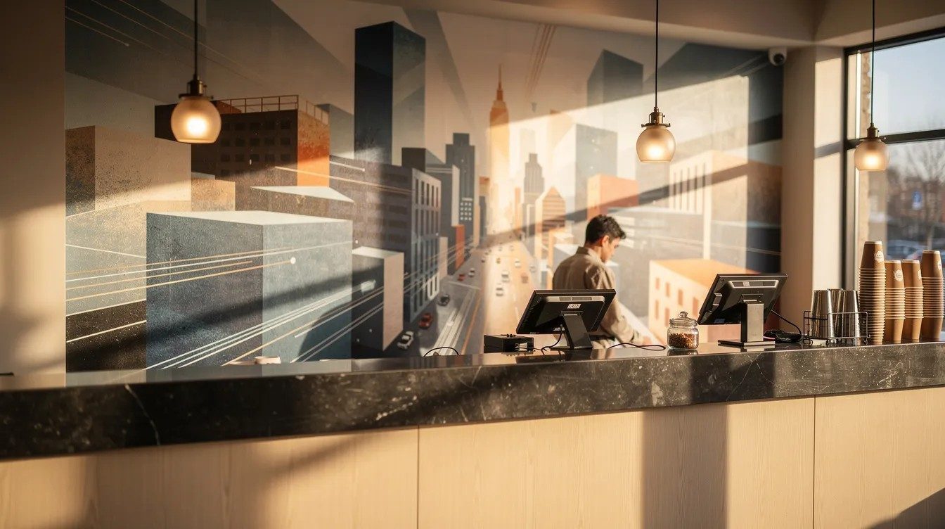
    Printed wall murals transform unattractive walls into focal points by covering an entire surface with a single dramatic image or design. Think cityscapes, abstract textures, nature photography or company story timelines along a corridor. Printed wall murals transform entire surfaces into focal points and are popular in receptions, open-plan offices, showrooms, gyms, cafes and hotel lobbies.

    Murals can be designed to distract from damaged walls by directing attention to imagery rather than minor wall imperfections. For more on the design process, read our guide to wall graphics design.

    3. Decorative Wall Panels

    Wall panels are a solid way to fix ugly walls that are uneven, marked or previously patched. They create a new, clean face in front of the old surface. Wall panelling can turn a bland wall into an architectural feature.

    Options include:

    • Timber-style slat panels: Wood slat panels add modern texture and warmth to walls and suit offices and hospitality venues.
    • Acoustic felt panels: Acoustic wall panels reduce noise while covering dull surfaces, with NRC ratings often between 0.65 and 0.95. Acoustic wall panels also reduce noise while enhancing visual appeal in open-plan workspaces.
    • Composite or printed panels: Suitable for corridors, meeting rooms and long runs where damaged walls need consistent coverage.

    Panels can run floor-to-ceiling or part-height and are especially useful in hallways where sound control and aesthetics both matter.

    4. Decorative Wall Coverings

    Printed wallpaper, commercial vinyl coverings and other decorative skins offer a quick way to cover flaws. You can cover an ugly indoor wall using removable wallpaper, and textured wallpaper can help conceal imperfections on a wall that is otherwise smooth enough to accept adhesive coverings.

    Removable wallpaper can create a bold pattern that masks the surface underneath, while peel-and-stick wallpaper is easy to apply and remove, making it popular for leased commercial spaces. Faux finishes can add texture and disguise surface imperfections where a more crafted look is needed.

    5. Large Artwork or Branded Displays

    Sometimes you do not need to cover the entire wall. Large-scale wall art can boost perceived style by 30% and can cover imperfections effectively. Large artwork often looks more intentional than many smaller pictures, giving a space personality and depth.

    A gallery wall can draw attention away from the underlying surface, and gallery walls can increase aesthetic appeal by 25%. Using large-scale art or a gallery wall can distract from wall flaws in hallways, stairwells and meeting rooms. Printed display boards, storyboards or timeline panels work well in reception areas where you can both disguise blemishes and tell your story.

    For printed options, explore our range of printed signs and display graphics. This approach suits tenants who want reversible, non-destructive ways to cover ugly walls in leased premises.

    6. 3D Logos and Dimensional Lettering

    Installing a 3D logo sign or dimensional business lettering on a plain or previously patched wall can transform it into a strong branded focal point. Examples include acrylic or metal logos above a reception desk, built-up letters behind a bar area, or dimensional branding in a showroom.

    A bold 3D logo combined with subtle background colour or panels helps an ugly wall become the main statement rather than an eyesore. Statement lighting can shift attention toward lighting rather than wall texture, so consider adding LED highlights behind or above dimensional elements. This works particularly well when the wall is structurally sound but visually dull.

    See our 3D logo lettering options for inspiration.

    7. Shelving and Display Units

    Shelving is one of the most practical ways to cover an ugly wall in shops, cafes, salons and offices. Creating functions on a wall with shelving or decor can make it useful rather than just decorative. Floating shelves, modular retail display systems, bookcases or product bays all sit in front of damaged walls and reduce attention on the surface itself.

    Large decorative mirrors can reflect light and hide wall flaws when placed among shelving arrangements. Large mirrors can bounce light around the room and enhance the space, making a small room feel bigger.

    8. Plants or Green Features

    Adding plants in front of or on an ugly wall can soften the space and bring warmth. Living green walls improve air quality and aesthetics indoors. Vertical indoor gardens introduce living colour and organic shapes to reception areas and hospitality venues.

    For areas where maintenance is an issue, artificial living walls require no watering or maintenance and offer a fast way to cover an ugly wall.

    Climbing plants like ivy can disguise ugly walls effectively on garden wall areas or outdoor seating zones. Trailing artificial ivy can be draped over trellises or hooks for a quick refresh, and faux bamboo adds warmth and texture to fences and walls around commercial entrances. Artificial greenery is especially practical where natural light is limited.

    9. Curtains or Fabric Wall Hangings

    Fabric wall hangings add warmth and texture to spaces and are flexible ways to hide ugly walls quickly in event venues, conference suites, function rooms and hospitality settings. Full-height curtains on tracks can conceal uneven or patched walls and also help zone large open-plan areas, giving privacy where needed.

    Fabric wall hangings can reduce sound reflection by 15%, and textile hangings help absorb sound and conceal wall flaws in rooms with hard flooring. Fabric wall hangings soften rooms and mask imperfections, while fabric wall hangings can cover unattractive walls easily without permanent fixings.

    These are useful answers for how to hide ugly walls without paint when you need a reversible, fast installation.

    10. Create a Complete Feature Wall

    Instead of simply hiding flaws, turn the ugly wall into a deliberate feature wall that adds value. You can use texture to disguise uneven walls instead of trying to make them disappear entirely. Colour drenching can make awkward features visually disappear, or you can paint a wall in a deep colour to create a striking focal point as a base for other elements.

    Consider combinations such as:

    • Wall graphics plus a 3D logo for branded impact
    • Panels plus integrated LED lighting to create depth
    • Shelving with branded backboards for a mix of function and style
    • Artwork, plants and display items layered for creativity and personality

    This approach answers how to make ugly walls look good in a way that also supports customer experience and staff pride rather than a quick cover up.

    How to Choose the Right Way to Cover an Ugly Wall

    There is no single best way to cover an ugly wall. The right decision depends on your budget, the wall condition, lease terms, branding needs and how long you will occupy the space.

    Covering an Ugly Wall Without Painting

    How to cover an ugly wall without painting is one of the most common questions, especially in rented commercial spaces. Non-paint options include graphics, wall panels, large artwork, gallery walls, shelving, fabric curtains and greenery.

    Wall decals are removable and ideal for temporary spaces, and removable graphics systems or freestanding displays work well where landlords restrict permanent changes. Temporary wall fixes prevent losing your security deposit. Frosted window film upgrades glass walls for a professional look where glass partitions are involved.

    What Is the Cheapest Way to Cover an Ugly Wall?

    There is no single cheapest answer. Cost depends on wall size, level of damage, access, and whether you need professional installation. For small areas, cheap ways to cover ugly walls include framed posters, basic gallery walls, off-the-shelf fabric wall hangings or lightweight shelving.

    For large spaces, modular panels or well-planned graphics tend to be more cost-effective over time because they are durable and impactful. Compare total cost of ownership, including preparation and expected lifespan, rather than only the initial material price. Safety and compliance should never be sacrificed for the lowest-cost option.

    Temporary vs Permanent Solutions for Damaged Walls

    Businesses in short leases, pop-up shops or event venues will often prefer temporary ways to hide ugly walls:

    TemporaryMore Permanent
    Freestanding display standsFixed wall panels
    Removable fabric backdropsFull wall murals
    Rented green wallsBuilt-in shelving systems
    Removable decals and graphicsInstalled dimensional logos
    Clip-on pegboardsProfessionally applied graphics

    Temporary solutions are easier to remove without damaging walls, which protects deposits and keeps landlords happy. A mix can work well: permanent panels on key walls with temporary branding layered on top for campaigns or events.

    Ideas for Offices, Shops and Customer-Facing Spaces

    The image shows a striking before-and-after transformation of a commercial feature wall; on the left, a dull and patchy wall with visible imperfections, and on the right, a stylish finished wall adorned with branded graphics, dimensional lettering, and warm accent lighting, creating a focal point that effectively hides flaws and adds depth to the space.

    Different sectors have different priorities when covering an ugly wall. Offices may focus on staff morale and meeting room aesthetics, while shops need product display and brand impact. Even a garden wall area visible to customers at an outdoor entrance can benefit from some of these ideas.

    Offices and Receptions

    For offices, receptions and meeting rooms, consider framed artwork, gallery walls, custom graphics, printed panels, green features and dimensional logos. These are strong answers for how to decorate an ugly wall in spaces used for client visits, presentations and team meetings.

    Office managers might include values, timelines or project imagery within gallery walls to bring personality and make the decoration meaningful. For deeper design advice specific to office spaces, read our guide to designing office wall graphics.

    Shops and Retail Spaces

    Shops can use shelving, product displays, wall graphics, printed boards and fabric features to turn previous-tenant or damaged walls into sales-driving areas. Create small focal point walls behind key product ranges, pay points or feature tables, especially where the existing finish is patchy.

    Gallery walls, mirrors or statement artwork also work in boutiques, salons and barbers, helping to cover ugly walls while reinforcing brand style. Keep walkways clear and ensure fixtures are safely secured, particularly when covering an ugly wall close to customer circulation routes.

    Which Wall-Covering Option Is Best for Your Business?

    The best way to cover an ugly wall depends on wall condition, budget, lease length and how visible the wall is. Here is a quick decision guide:

    • Damaged or damp wall: Fix the underlying problem first.
    • Branding is a priority: Explore graphics, murals or dimensional logo signs.
    • Temporary space: Use freestanding displays, fabric wall hangings and removable graphics.
    • Functionality needed: Shelving, pegboards or writable walls can both hide ugly walls and add everyday usefulness.
    • Strong visual impact needed: Combine several options into a complete feature wall to give the room a proper glow up.

    Many businesses choose to discuss options with a signage or interiors partner to balance appearance, durability and compliance. The right solution depends on your specific wall, environment, branding goals and expected lifespan.

    How Manchester signs center Can Help You Cover Up Ugly Wall

    With the right approach, an ugly wall can become a useful, stylish feature rather than something you try to ignore. Solutions range from a quick, low-cost refresh to a complete feature wall that supports your branding and visitor experience.

    We are Manchester signs center, a Manchester-based sign maker that designs, manufactures and installs custom wall graphics, printed murals, display boards and 3D logo signs for businesses across Manchester and the wider UK. Our team offers free design support, a dedicated project manager, UK-wide delivery and a typical turnaround of 1 to 3 weeks.

    If you are considering professional graphics, printed displays or dimensional branding for your walls, get in touch for a quote and we will help you choose the right solution for your space.

    FAQs About Covering Ugly Walls

    How do you cover an ugly wall in a commercial space?

    Start by checking for damp or structural problems, then choose from wall graphics, murals, wall panels, artwork, shelving or fabric depending on budget and lease terms. The most effective solution usually combines visual impact with day-to-day practicality.

    How can I hide an ugly wall without painting?

    You can cover an ugly wall without painting by using removable graphics, framed gallery walls, freestanding shelving, fabric curtains, plants or temporary panels. These are popular in rented offices and retail shells where landlords limit permanent changes.

    What is the cheapest way to cover ugly office walls?

    Simple framed prints, basic shelving, low-cost fabric wall hangings and selective use of decals are often the cheapest starting points for small areas. For large ugly walls, it can be more economical over time to invest in durable panels or well-designed graphics.

    Can you put wall graphics over an uneven or textured wall?

    Suitability depends on how uneven the wall is and the specific graphic material. Slight texture is often manageable, but very rough or crumbly surfaces are not ideal. Consider lining panels or a professional survey if the wall is significantly uneven.

    What can I use to cover an ugly brick or blockwork wall?

    Options include decorative wall panels fixed to the brick, green wall systems, large artwork, shelving units or, where the surface allows, suitable graphics designed for masonry. For external or semi-external areas, check weather resistance and fixing methods carefully for safety and longevity.

  • Local Business Advertising: Offline Ideas to Advertise Your UK Business Locally

    Local Business Advertising: Offline Ideas to Advertise Your UK Business Locally

    Local business advertising does not have to begin on a screen. If you run a shop, café, office or trades company, there are places to advertise local business right outside your door: your shopfront, your windows, your vehicles, nearby streets, printed materials, local events, partnerships with other local businesses and temporary promotional spaces.

    These methods work because they reach potential customers who are already in your local area. The person walking past your fascia sign at lunchtime, the driver noticing your branded van in traffic, the family picking up your flyer at a community fair: these are people who live, shop, work or travel near your premises.

    For any small business that depends on a local customer base, physical presence is one of the most direct ways to advertise your business locally and grow recognition.

    At Manchester signs center, we specialise in advertisement signage for commercial buildings, shops and offices. Our team design, manufacture and install signage across Manchester and the wider UK, and we see first-hand how strong offline visibility helps local businesses attract more customers.

    Why Offline Local Business Advertising Still Matters

    Even in 2026, physical visibility remains essential for any business with a premises or service area. According to YouGov research, 28% of Britons notice out-of-home advertising at least once a day and 34% notice it several times a week. Only 2% say they never notice it at all.

    Offline advertising with traditional methods reaches people present in the local area, including:

    • Commuters on Chapel Street in Salford
    • Shoppers in UK shopping malls and town centres
    • Office workers walking to lunch in commercial buildings
    • Residents driving past on their daily route

    Repeated exposure to the same fascia sign, pavement board or banner makes a business stand out and feel familiar to more local customers.

    Clear outdoor signs help potential customers quickly see what the business does, where the entrance is and whether it is open. This kind of local presence connects a brand to a specific place, which can be particularly important for professional offices and commercial buildings that want to appear established and trustworthy.

    12 Offline Ways to Advertise Your Business Locally

    These ideas can be mixed and matched depending on whether you run a retail shop, café, office, trade company, clinic or salon. The focus is on using your building, local streets and physical promotional tools. 

    At Manchester signs center, we can help design and produce many of the advertising elements below, with a typical 1 to 3 week turnaround and a dedicated project manager for each job.

     Infographic showing 12 offline ways to advertise a local business, including shop signs, window graphics, vehicle branding, banners, flyers, events, sponsorships & local partnerships.

    1. Turn Your Business Premises Into Advertising

    Your building is usually the best advertising for local business, especially on busy routes like Manchester’s Deansgate, the A6 or around the Trafford Centre. Clear shopfront signage should communicate at a glance:

    • Business name
    • What the business does
    • Where customers should enter
    • Whether the business appears open

    Fascia signs, 3D lettering and illuminated signs help a business stand out during darker winter afternoons and on crowded high streets. Include opening hours and key selling points near the main entrance so people passing by can decide quickly whether to step inside. Keep the design bold, uncluttered and readable from across the road, with high contrast colours and the logo clearly visible.

    2. Use Your Windows to Promote Local Business

    Windows are often the largest and most visible advertising space available to local businesses, facing pedestrians and road traffic all day. Window graphics can display your business name, services, opening hours and simple promotional messages such as “Lunch offer 12 to 3pm” or “Same-day repairs”.

    Full-colour window vinyls support product launches and seasonal campaigns (Christmas offers, summer sales, January promotions) without repainting or refitting the premises. Frosted or one-way graphics improve privacy for offices, salons or clinics while still carrying branding and company information.

    Removable or short-term graphics are ideal for temporary offers, helping a small business change its message without replacing permanent signage. We design and install custom window graphics across Manchester and the wider UK, with free design support to get the message and layout right.

    3. Make Your Business Visible From the Street

    This is about catching attention from people moving past on foot, by bus or by car.

    • Projecting signs mounted at 90 degrees to the building help people see the business name as they walk along terraced rows of shops.
    • Pavement signs and A-boards placed near the entrance advertise daily specials, key services or time-limited offers, drawing potential customers inside.
    • Feather flags or teardrop flags work well on forecourts, car parks and wider pavements, particularly for car dealerships, gyms and showrooms.

    Readability is critical: short, bold messages, large lettering and simple colours that can be understood from a distance or at 30 mph. At Manchester signs center, we can advise on sign placement, especially around corners, junctions and shared entrances in commercial buildings.

    4. Advertise With Company Vehicles

    Branded vehicles are a moving form of local business advertising, turning ordinary journeys into daily exposure across the service area. Typical vehicles include:

    • Vans for trades and deliveries
    • Company cars for sales teams
    • Service vehicles for engineers
    • Small fleets for regional coverage

    Simple, consistent vehicle branding should show your logo, business name, key services (e.g. “Heating & Plumbing”) and one main contact method such as a phone number.

    Vehicles parked outside customers’ homes, offices or on busy residential streets act as mobile signs, reinforcing your business stand in the area. Keep designs clean so target customers can understand who you are within a few seconds. We offer vehicle graphics including partial wraps and cut vinyl lettering for businesses that want to promote their brand on the road.

    5. Use Banners for Temporary Local Promotions

    Banners are a flexible, low cost way to promote short-term local campaigns: grand openings, “Now Open” announcements, seasonal sales, new product launches. For example, a new salon in Salford Quays might use a “Opening November 2026” banner, or a warehouse might face the main road with a bold “Final 3 Days” message.

    PVC and mesh banners can be fixed to railings, fences, hoardings or temporary frames. Keep banner messages simple with a strong headline, date or limited-time detail, and a clear call to action such as “Visit today” or “Show this banner for 10% off”. 

    Banners are easy to roll up and reuse each year for recurring events like summer fairs or Black Friday promotions, making them one of the best advertising methods for small businesses on a budget. Our banner printing service offers fast turnaround and UK-wide delivery.

    6. Use Flags and Pavement Displays

    Custom flags and portable pavement displays are ideal for drawing attention around entrances, forecourts and walkways into UK shopping malls or business parks. They flutter above parked cars or crowd lines, signalling that something is happening at your business location.

    Use them to highlight limited-time offers, trial days, launch weekends, open evenings or membership drives. Because they are portable and reusable, flags and pavement displays can be moved between locations, making them one of the best ways to advertise your business locally at events and pop-ups.

    7. Distribute Flyers and Printed Promotional Material Locally

    Flyers, leaflets and menus put information about your business directly into people’s hands. Business cards are a cost-effective way to promote your services in face-to-face settings. Targeting matters more than volume: a new café might distribute menus within a 10-minute walk of the premises, while a tradesperson may focus on specific postcodes to reach a specific audience.

    Include a clear offer or reason to respond, such as “10% off your first visit with this flyer” or “Free quotation in M50 and M6 postcodes”. You can also incorporate referral and loyalty programs to incentivise word-of-mouth marketing.

    Designs should match the look of the shopfront and signage so people recognise the business when they pass it later. Flyers can sit on reception desks, community notice tables or in partner businesses, acting as simple reminders. Flyer campaigns work best alongside strong premises signage and window graphics.

    8. Attend Local Events, Markets and Exhibitions

    Attending local events, trade shows, artisan markets and business exhibitions brings you face-to-face with people already interested in your type of product or service. Participating in local events can increase your business visibility for free and helps build a human connection with your target audience.

    Branded exhibition displays, pop-up stands and tablecloths make a small business look professional in busy venues. Use portable banners, flags and display boards around your stall to show services, prices and offers clearly.

    Take printed materials like brochures, menus or vouchers so visitors leave with something that reminds them of your business afterwards. These events also generate buzz and media coverage in ways that static advertising cannot.

    9. Sponsor Local Events, Teams or Community Activities

    Sponsorship lets you promote your business locally while supporting the local community: youth football teams, school fairs, charity runs, neighbourhood festivals. Engage in community sponsorships or local events to build trust and strengthen your local presence.

    Sponsorship can include your logo and business name on banners, pitch-side boards, event programmes, T-shirts or stage backdrops. For example, sponsoring a 2027 charity 10k in Manchester with branded wayfinding signs and finish-line banners showing your logo.

    While sponsorship does not guarantee direct sales, it increases local brand recognition and positions the business as part of the community. At Manchester signs center, we often design and produce the physical event signage used for local sponsorships, such as banners, flags and directional boards.

    10. Partner With Nearby Businesses

    Offline cross-promotion with neighbouring businesses can expand reach without a large advertising spend. Partner with local businesses for cross-promotional opportunities and you tap into each other’s existing customers.

    Examples:

    • A café displaying leaflets from a nearby businesses hair salon
    • A gym hosting a pop-up from a local nutritionist
    • An office block showcasing tenants on shared lobby signage

    Run joint promotions such as “Show your receipt from Partner A for 10% off at Partner B” to encourage people to visit both locations. You can track unique promo codes to evaluate local advertising effectiveness. Co-branded posters, window graphics or small counter-top signs can advertise these partnerships where current customers already stand and queue.

    11. Use Temporary Signs for Sales, Openings and Campaigns

    Permanent signage builds brand identity. Temporary promotional signs handle short-term activity:

    • “Coming Soon” hoarding graphics on a new restaurant
    • “Opening January 2027” window vinyls on a salon
    • “Summer Sale” banners on a retail unit
    • “Refurbishment Under Way” signage to reassure loyal customers

    These temporary signs can go on hoardings, windows, railings and internal walls. They build anticipation for new customers and keep your business page visible during transitions. Remove them promptly once the campaign ends to keep premises looking professional.

    Manchester signs center regularly produces promotional signs, banners and temporary window graphics with fast turnaround for launches and sales campaigns across the UK.

    12. Keep Your Branding Consistent Everywhere

    The best ways to advertise your business locally work even better when branding is consistent across every touchpoint. Your shopfront, fascia, window graphics, interior signs, vehicle livery, banners, event displays and printed materials should use the same logo, colours and core message.

    Consistency helps potential customers connect the flyer they saw at home with the sign they notice on the street or the van they pass in traffic. Create a simple brand guide covering logo usage, colours, fonts and tone of voice. 

    At Manchester signs center, we can help a local business refresh or unify its offline visual identity so your business appears the same wherever local audiences encounter it.

    What Is the Best Advertising for a Local Business?

    There is no single “best advertising for local business” because the right approach depends on your sector, business location, footfall and budget. Here is how it breaks down:

    Business TypeRecommended Offline Advertising
    Retail shopShopfront and fascia signs, window graphics, pavement signs, occasional banners for sales
    Restaurant or caféIlluminated exterior signs, menus in windows, chalkboard or printed pavement displays, flags for new menu launches
    Trades or service businessVehicle branding across vans and cars, simple external signs at the yard or office
    New local business“Coming Soon” hoardings, opening banners, temporary posters, then permanent fascia signs
    Event or seasonal businessPortable displays, banners, flags and temporary signage that move between venues and are reused year after year
    Office or professional practiceDiscreet building identification, entrance signs, reception branding, wayfinding for visitors

    Local business advertising works best when it matches where and how potential customers actually move around the local area. Measure the effectiveness of advertising campaigns by tracking customer acquisition costs and revenue to understand what delivers.

    How to Advertise a Local Business on a Small Budget

    The best advertising for small business does not always require a large marketing strategy budget. It often needs smart use of assets you already have:

    • Refresh existing premises: clean tired signs, add simple window graphics or use a single pavement sign with a strong message.
    • Brand vehicles already on the road: a set of van graphics can be a cost-effective way to promote my business locally across the whole service area.
    • Invest in reusable materials: banners and flags for repeated events (“Annual Summer Sale”, “Open Day”) rather than reprinting each time.
    • Form partnerships: share stands at local events with nearby businesses, co-host open days or cross-display printed materials, reducing individual costs.
    • Community networking and referrals: attend local business groups, leave business cards at friendly venues and ask satisfied customers to pass on flyers. Encourage positive reviews to boost local rankings and reputation.

    Even on a tight budget, investing in one strong shopfront sign or a simple set of vehicle graphics can deliver more local presence than multiple smaller, inconsistent items. At Manchester signs center, we offer free design support to help local business owners get the most from limited signage budgets.

    Permanent vs Temporary Local Advertising

     Two colourful feather flags and a wooden A-board pavement sign positioned outside a small gym in the UK, situated on a wide pavement with cars passing by on the road. 

    Effective local business advertising usually combines permanent elements for everyday visibility and temporary elements for campaigns and offers.

    Permanent visibility includes shopfront signage, fascia signs, 3D lettering, building identification, post signs and vehicle graphics. These stay in place for years and act as constant markers so your business appears familiar to repeat local customers. They answer the basics: who you are, what you do and where you are.

    Temporary visibility includes banners, promotional graphics, flags, portable displays and temporary window graphics used for specific dates, events, seasons or limited-time offers. Examples:

    • “Black Friday weekend sale”
    • “Business relocating February 2027”
    • “New product launch this month”
    • “Christmas menu now available”

    Most companies need both types. A permanent illuminated fascia plus temporary banners for each quarterly promotion is a common combination. Manchester signs center can plan a mix of permanent and temporary signage, with many projects designed, manufactured and delivered within 1 to 3 weeks.

    How to Make Offline Advertising More Effective

    Here are key tips any local business can follow to make physical advertising clearer and more impactful:

    • Keep messages simple. One main idea per sign or banner. Most people only have a few seconds to read.
    • Make the business name prominent. The logo or name should be large, not lost among images or background patterns.
    • Consider viewing distance. Text on a fascia read from across the street must be larger and simpler than text on a reception sign viewed at two metres.
    • Use readable typography. Avoid decorative fonts or long blocks of text. Bold, high-contrast lettering works in bright sunlight and low light.
    • Maintain consistent branding. Use the same colours, fonts and logo positioning across shopfronts, vehicles and printed materials so everything feels connected.
    • Include clear calls to action. Phrases suited to offline use: “Visit us on Chapel Street”, “Call for a free quotation”, “Open 7 days” or “Sale now on” help increase foot traffic by prompting phone calls or visits.
    • Think about placement. Signs should face the direction of main footfall or traffic and not be hidden behind trees, parked cars or other signage.

    In the UK, planning permission or landlord approval may be required for some external signs. Check the UK government’s guidance on outdoor advertisements (no-follow) or speak to your local council’s planning department before installing large or illuminated signage.

    Get Expert Help to Maximise Your Local Advertising Impact

    We recommend speaking to a specialist like Manchester signs center, who can visit or review photos of the site, propose options and provide free design support to match signs to the real-world environment, helping you create valuable content for your physical space, generate more customer enquiries and make your business stand out to more customers.

    If you need signage for a specific opening date, contact us as early as possible so timelines can be planned around that date.

    Frequently Asked Questions

    How much should a small business spend on offline local advertising?

    There is no fixed percentage of local advertising for small business, but start by prioritising core essentials: a clear shopfront sign, basic window graphics and, if relevant, simple vehicle branding. Think in phases: phase 1 for essential permanent signage, phase 2 for a small budget for banners and temporary promotions, and phase 3 for exhibition or event displays as the business grows.

    Do I need permission to put up signs outside my premises?

    In the UK, external signs may be subject to planning rules under the Town and Country Planning (Control of Advertisements) Regulations 2007, especially on listed buildings, in conservation areas or in shared commercial sites. Check with your local council’s planning department before installing large or illuminated signs.

    How long does it take to get new signs installed?

    Typical lead times for many commercial signs from Manchester signs center are around 1 to 3 weeks from design approval to manufacture and delivery, depending on complexity and size. Larger projects, such as full building rebrands or extensive interactive wayfinding solutions in multi-storey offices or UK shopping malls, may require more time for surveys and planning.

    Can offline advertising work without any online marketing?

    Many local businesses, such as cafés, salons, garages and convenience stores, rely heavily on passing trade and word of mouth. Strong offline visibility with engaging content on your signs and clear contact details, including a phone number, address and opening hours, makes it easy for new customers to act without needing a Google search or visiting a business page online.

    While combining offline and online content marketing can be helpful. PR campaigns and press releases can also generate local newspaper coverage and reach a huge audience without relying on digital displays, search results, online content, search engine results, or social media platforms.

    How do I choose between different sign types for my premises?

    Start with three questions: who needs to see you (pedestrians or drivers), from what distance, and at what times of day (daylight or evening with high-brightness screens). The answers will determine which sign type will be most effective for attracting local audiences and target customers to your business.

  • Printed Wallpaper vs Wall Graphics: Which Is Best for Commercial Interiors?

    Printed Wallpaper vs Wall Graphics: Which Is Best for Commercial Interiors?

    UK businesses from corporate to retail spaces and hospitality venues treat their walls as communication surfaces. When they plan a fit-out or rebrand, they got confused in printed wallpaper vs wall graphics. The answer depends on what you need the wall to do, and for how long.

    The short answer: For most commercial interiors where branding changes every one to three years, custom wall graphics deliver faster installation, lower disruption, and easier updates. For reception feature walls, hotel corridors, and boardrooms where a lasting impression and tactile quality matter more than flexibility, printed commercial wallpaper is the stronger choice.

    At Manchester signs center, we design, manufacture, and install office wall graphics and we frequently specify a combination of both options. With free design support and a typical 1 to 3 week turnaround from artwork approval, we help clients get the right wall design for every space.

    Printed Wallpaper vs Wall Graphics: How They Compare at a Glance

    This table gives facilities managers and marketing teams a quick overview of the key differences between the two approaches for commercial spaces.

    FactorPrinted Commercial WallpaperCustom Wall Graphics
    Best forFull architectural finish; feature walls; entire room coverageAgile branding; campaigns; modular messaging
    Typical locationsReceptions, corridors, restaurants, boardroomsMeeting rooms, breakout spaces, glass partitions, retail environments
    Installation methodPaste-the-wall or pre-pasted wet application; professional installation requiredDry-apply peel and stick; professional squeegee mount for large formats
    Average lifespan7 to 10+ years3 to 7 years
    Surface requirementsTolerates slight textures and minor imperfectionsRequires smooth surfaces, properly primed flat drywall
    Update difficultyStrip and repaper; may require wall repairSimple peel-and-replace of individual elements
    Fire ratingHigh-grade commercial fire certifications (Class 0/1, EN tested)Standard commercial self-adhesive vinyl ratings; specify carefully

    The core trade-off when weighing printed wallpaper vs wall graphics: wallpaper delivers permanence and tactile depth; graphics deliver flexibility and speed.

    What Are Printed Commercial Wallpapers?

    Printed commercial wallpaper refers to heavy-duty, digitally printed wall coverings in exact wall size manufactured for non-domestic interiors: offices, hospitality, retail, healthcare, and public-sector buildings.

    • Typical materials: fabric-backed vinyls, non woven wallpaper substrates, and textured finishes such as linen embossing. Non woven material is dimensionally stable, meaning it does not expand or shrink when paste is applied, reducing the risk of peeling and mould.
    • Common applications: hotel corridors with pattern repeats, corporate boardrooms, meeting suites, shopping mall corridors, and statement walls in restaurants. Printed wallpaper creates a continuous visual effect across walls or rooms and is commonly used in dining rooms and hallways for consistency.
    • Wallpaper design scope: photographic scenic landscapes, brand patterns, abstract art, city maps, and subtle repeating design textures. Wallpaper features a repeating pattern across walls, while wall murals consist of a single large-scale image. Both wallpaper and murals can be custom-printed to wall dimensions.
    • Expected lifespan: 7 to 10+ years in commercial environments with proper cleaning. Printed wallpaper can last for over 10 years if installed correctly, and quality non-woven wallpaper lasts 10 to 15 years. Wall murals printed on non woven material last 10 to 15 years as well.

    Wallpaper is used for full-room coverage and residential feature walls, and it is ideal for consistent visual rhythm across multiple walls.

    What Are Custom Wall Graphics?

    Interior design with a plain paint in branded colours complemented by vinyl cut lettering and a company logo prominently mounted on the wall showing the use of wall graphics.

    Custom wall graphics are self-adhesive vinyls, decals, cut vinyl lettering, and contour-cut logos applied directly to painted walls or glass. Wall graphics are made from flexible cast or calendared vinyl films with adhesive backing, and they typically use peel and stick adhesive backing for application.

    • Types: full-wall vinyl murals, contour-cut logos, typography, wayfinding arrows, glass manifestations, and bespoke wall graphics for department zoning. Wall graphics can feature standalone images or cut-out decals applied directly to walls.
    • Typical materials: monomeric and polymeric vinyls finished with matte, satin, or textured protective laminates.
    • Common office uses: core values displays, timeline walls, department zoning, agile sprint boards, branded visuals, and meeting room naming. Wall graphics are effective for branding and communication in various environments and are used for corporate branding and retail promotions.
    • Lifespan: around 3 to 7 years for indoor office wall graphics, depending on traffic and cleaning regime. Peel-and-stick formats last 5 to 10 years, while peel-and-stick wallpaper typically lasts 1 to 5 years.

    Unlike wallpaper, graphics can be replaced in part; a single logo or strapline swaps out without disturbing the rest of the wall.

    Factors to Consider While Deciding From Printed Wallpaper VS Wall Graphics

    Every commercial interior project has different priorities. Below are the five factors that most often determine the material selection.

    Brand Flexibility & Ease of Updating

    Printed commercial wallpaper is better suited to stable brand assets and long-lived interiors. Updating usually means stripping and repapering entire walls. Removal of printed wallpaper can be labour-intensive depending on the adhesive used.

    Custom wall graphics allow individual elements (logos, straplines, values statements) to be swapped without touching the surrounding wall. Wall graphics can be easily updated and removed with minimal disruption. A retail chain rolling out monthly promotions can replace vinyl window and wall graphics in hours, while keeping the painted wall underneath untouched.

    Peel and stick murals are perfect for renters and temporary decor, and wall graphics are typically more cost-effective for temporary displays or promotions.

    When planning layouts that anticipate future changes, it helps to design office wall graphics with modular zones from the start so each element can be updated independently.

    Visual Impact, Texture & Perceived Quality

    Printed wallpaper can mimic concrete, wood, linen, or bespoke patterns. It gives a continuous, architectural finish with hidden joins when professionally installed, and it masks minor imperfections to deliver a luxurious aesthetic.

    Printed wallpaper offers a softer, textured, and interior-led feel. Commercial wallpaper enhances ambiance without overwhelming the environment, and it is ideal for consistent visual rhythm across multiple walls or even four walls of a statement room.

    Wall graphics deliver crisp edges and solid lettering with bold graphics, which makes them the stronger choice for logo reproduction, typography, and bold prints. The visual interest is more graphic and modern; there is less tactile depth unless you specify speciality textured vinyl laminates.

    Surfaces, Durability & Maintenance

    Printed wallpaper is thicker and can bridge small cracks, uneven paint, and textured surfaces. Heavy-duty textured vinyl substrates (around 350 g/m², approximately 0.50 mm thick) absorb irregularities that would be visible under thinner materials.

    Printed wallpaper consists of paper, fabric, or vinyl-coated cellulose, and commercial-grade versions are often scrub-resistant with antimicrobial finishes. Direct sunlight fades all printed materials over time, but UV-resistant inks extend the lifespan to 7 to 10+ years in corridors, schools, NHS practices, and shopping centres.

    Wall graphics need smooth, well-primed walls. On textured surfaces, adhesive film tends to lift at edges and “telegraph” bumps underneath. Bathrooms with poor ventilation can shorten wall covering lifespan for both options. On the positive side, if a single graphic panel gets damaged, you can replace just that element rather than re-covering the entire wall.

    Both products must meet UK fire regulations for commercial interiors. Commercial wallpapers are commonly tested to Approved Document B (no-follow) standards, with fire classifications such as BS1-D0 for heavy-duty textured vinyl. Commercial-grade vinyls also need fire ratings, but some lower-cost films lack full certification; always specify EN or Class 0/1 rated materials.

    Installation Process, Downtime & Budget

    Printed wallpaper requires paste-the-wall technique, skilled installers, furniture protection, and drying time. The installation process involves precise pattern alignment and preparation; paste needed for each drop must set properly before the next stage.

    Installation of wallpaper can take 2 to 4 hours for a small wall, and larger schemes are best scheduled over evenings or weekends. Professional installation for wallpaper costs $200 to $500 (approximately £160 to £400). Traditional wallpaper costs $2 to $10 per square foot.

    Wall graphics are dry-apply, can be fitted in occupied offices with phased rollouts, and smaller schemes can be completed out of hours in a single night.

    Wall mural installation typically takes 2 to 3 hours with two people. Peel-and-stick murals cost $1.50 to $6 per square foot. Murals are easier to install due to pre-numbered panels, and peel-and-stick wallpaper is beginner-friendly for DIY installation, although we recommend professional installation for commercial spaces to avoid bubbles and misalignment.

    Wallpaper and wall murals start at similar per-square-foot rates, but cost drivers include complexity, surface preparation, access equipment, and the number of designs across multiple panels or multiple walls. However, their long term value avoids repeated replacement costs.

    Creative Scope, Custom Design & Brand Storytelling

    Printed commercial wallpaper is ideal for panoramic cityscapes, custom wall murals depicting scenic landscapes, and abstract patterns using brand colours. A timeline or map running the full length of a corridor works because wallpaper creates a continuous visual effect that can completely change an entire room.

    Wall graphics are perfect for layering short messages, icons, directional cues, QR codes, and interactive campaign elements over neutral walls or glass. You can use your own photo as a one-wall vinyl mural or apply cut vinyl lettering to transform a single wall into a focal point. Wall graphics provide endless possibilities for modular storytelling where elements rotate seasonally.

    A combined scheme works well: wallpaper backdrop in reception plus layered vinyl logos and wayfinding across the rest of the floorplate. For deeper thinking on how to approach office wall branding and cultural storytelling, the starting point is matching the medium to the message.

    Printed Wallpaper vs Wall Graphics: Which Should You Choose for Commercial Spaces?

    The right material choice depends on your priorities, not on one option being universally better.

    • Choose printed commercial wallpaper if you want a long-term, high-end look in receptions, boardrooms, hotel-style lounges, and busy corridors where texture, resilience, and a lasting impression matter most. Traditional wallpaper lasts 10 to 20 years in well-maintained interiors.
    • Choose custom wall graphics if you need agile branding, seasonal offers, departmental zoning, and easily updated messages across offices, retail spaces, and education settings. Peel and stick murals can be removed without damaging paint, making a room refresh straightforward.
    • Choose a mix of both if you are rolling out a full building rebrand and want immersive backdrops plus flexible messaging overlays. Both wallpaper and murals can be custom-printed to wall dimensions for a cohesive scheme.

    When weighing printed wallpaper vs wall graphics, measure carefully the balance between permanence and flexibility for each zone in your building. You can also explore 10 other creative ideas to cover an ugly wall in your commercial space.

    Industry-Specific Recommendations for Commercial Interiors

    Different sectors lean towards different solutions based on traffic, cleaning requirements, and how often branding changes.

    Corporate offices & tech hubs

    Use printed wallpaper in reception feature walls and boardrooms to set tone with subtle branding and custom design. Wallpaper is ideal for selecting wallpaper that provides consistent visual rhythm across the executive floor. For breakout spaces, department zoning, agile boards, and meeting room naming on walls and glass, office wall graphics deliver the modularity that fast-moving teams need.

    Retail stores & UK shopping malls

    Large-scale wall murals for business can define zones (kids, sports, homeware) with bold prints and photographic scenes that stay in place for years. For sales, offers, and product launches that change monthly or seasonally, removable wall graphics swap in and out with minimal disruption. This split keeps the investment efficient across retail environments.

    Hospitality, gyms & leisure venues

    Durable printed wallpapers anchor themed interiors (industrial, botanical, urban) that must withstand daily cleaning and high moisture. Look for vinyl wallpaper with antimicrobial coatings and fire-rated substrates. Custom wall graphics add class schedules, motivational quotes, directional arrows, and partner branding in spaces where content changes frequently.

    How Printed Wallpaper and Wall Graphics Work Together

    Many of our most successful commercial schemes use both wallpaper and wall murals, not just one. The combination captures the strengths of each medium.

    • Printed wallpaper as a continuous backdrop with floating acrylic or stand-off logos mounted on top, creating depth and visual interest on a single wall.
    • Neutral printed texture wallpaper in corridors with department names and icons applied as removable wall graphics, so the backdrop stays while the information layer updates.
    • Full-height printed commercial wallpaper in customer-facing areas; bolder, more experimental graphics in staff breakout spaces where existing decor can handle a different tone.
    • Custom wall art integrated into schemes where bespoke mural-style designs combine with layered vinyl elements.

    Transform Your Commercial Interior with Manchester signs center

    At Manchester signs center, we design, manufacture, and install both printed commercial wallpaper and custom wall graphics UK-wide from our Salford, Manchester base. Whether you need a single accent wall or a full building rebrand across multiple sites, we manage the process from survey to sign-off.

    • Free design support and material advice for offices, retail, hospitality, and public-sector interiors.
    • Fast 1 to 3 week turnaround on most wall graphics projects after artwork approval.
    • Dedicated project manager for surveys, RAMS, scheduling, and multi-site rollouts.

    Get in touch for a quote from our expert team. The right balance of printed wallpaper vs wall graphics gives you maximum brand impact from every square meter of wall space.

    Frequently Asked Questions

    Is printed commercial wallpaper harder to install than wall graphics?

    Yes. Wallpaper installation requires paste-the-wall hanging, precise edge alignment, and careful trimming. The installation of printed wallpaper requires paste or water-activated backing, and drying time adds hours to the schedule.

    Can wall graphics stick to textured walls or old plaster?

    Standard wall graphics work best on smooth surfaces: flat, painted, properly primed drywall. If your office walls feature heavy stippling, rough plaster, or brick texture, the vinyl will lift at edges and telegraph bumps underneath.

    For textured surfaces, heavier vinyl options or printed commercial wallpaper (which bridges minor imperfections) is the better material choice.

    Which lasts longer in busy corridors and stairwells?

    Printed commercial wallpaper generally outlasts standard graphics in heavy traffic. A well-specified Type II or III vinyl wallpaper with scrub-resistant finish can serve 7 to 10+ years in corridors, while standard wall graphics typically reach 3 to 7 years before edge lifting or fading becomes noticeable.

    Will removing wall graphics or wallpaper damage the walls?

    High-quality wall graphics feature removable or low-tack adhesive systems and peel away cleanly from properly primed drywall when heated gently during removal. Peel and stick murals can be removed without damaging paint. Removing printed wallpaper requires stripping, and depending on the adhesive and substrate, some light wall repair or re-skimming may be needed.

    How should we prepare our office walls before installation?

    Walls must be clean, dry, dust-free, repaired, and primed with high-quality acrylic paint. Newly painted walls must cure for at least 3 to 4 weeks to avoid adhesive failure for both wallpaper paste and vinyl decals. Measure carefully and confirm exact wall dimensions before ordering.

  • The 7 Main Types of Window Displays | Retail Display Guide

    The 7 Main Types of Window Displays | Retail Display Guide

    Window displays serve as a silent salesperson for every retail store From Manchester’s Market Street to London’s Oxford Street, the glass at the front of a shop is often the first and only chance to capture attention and turn passers by into paying customers.

    The types of window displays covered in this guide are the main structural formats retailers can choose from, and each one shapes how lighting, graphics and featured products are seen from the pavement. The right format depends on your retail space, sector (fashion, tech, independent coffee shop, jeweller), budget and desired brand identity.

    Choosing the right structure (open, closed, semi-closed, corner, island, shadow box, or digital) directly affects how well a shop window display attracts customers and drives footfall.

    At Manchester signs center, we create custom shop window displays for retailers across Manchester and the wider UK, covering everything from printed graphics to digital screen integration.

    Quick Overview: The 7 Main Types of Window Displays

    Type of Window DisplayDescription
    Open window displaysgive a clear view into the store; ideal for lively boutiques and cafes on busy high streets.
    Closed window displaysuse solid back panels to create a theatrical “stage” and remove store distractions.
    Semi-closed window displaysare part-open, part-screened layouts that balance intimacy with visibility.
    Corner window displayswrap around a corner window to capture foot traffic from two streets at once.
    Island window displaysare freestanding island window units in malls and concourses, viewed from all sides.
    Shadow box window displaysare compact, enclosed showcases for jewellery, watches and premium items.
    Interactive and digital window displaysuse high-brightness screens and interactive tech built into the glass.

    Why Window Displays Matter on the Modern UK High Street

    Window displays can communicate brand identity instantly. Strong visuals in displays reinforce that identity and leave a lasting positive impression on shoppers.

    Retail window displays attract attention and encourage shoppers to enter a store, and UK retailers that installed high-brightness digital window displays reported around 40% more foot traffic compared to their previous static windows.

    Window displays impact consumer decisions at three levels. First, instant visual engagement: bold window display design, clear focal points and seasonal themes help a store stand out within seconds. Second, brand personality reinforcement: colour palettes, typography, window graphics and props signal whether a store is playful, premium, eco-led or minimalist.

    Unique window displays enhance brand awareness and recognition across all of these approaches. Third, controlled line of sight: different types of window displays control what customers see first, whether that is hero products, offers or new arrivals, while hiding clutter on the shop floor.

    For step-by-step layout advice, see our guide on how to design a shop window display.

    The 7 Main Types of Window Displays Explained

    The following are the main types of window displays used across UK retail, from independents to national chains. Each format serves a different marketing objective, and retailers often combine them for a cohesive store design.

    1. Open Window Displays

    An open window display has no solid back wall. Shoppers on the pavement look straight through the glass and onto the store floor. Open window displays lack walls, connecting interior and exterior into one visual experience, and open-back window displays allow visibility into the store interior, creating an inviting atmosphere.

    This format suits boutiques, bookshops and cafes that want to show off a busy, welcoming space. Lighting mimicking natural daylight creates a relaxing atmosphere, making open displays especially effective in glass-fronted units with generous ceiling height.

    Open window displays create a seamless connection with the store, allowing customers to feel part of the interior before they step inside.

    Pros: spacious feel, strong street-to-interior connection, good use of natural light, low material cost.

    Cons: every visible part of the store interior must be tidy; cabling, stockroom doors and point-of-sale clutter can break the effect. The background is always on show, so in store displays and stock need constant attention.

    2. Closed Window Displays

    A closed window display at night, featuring a single mannequin on a raised plinth against a deep-coloured fabric backdrop. Focused spotlights create sharp shadows, enhancing the visual appeal and drawing attention to the elevated display in this retail space.

    Closed window displays feature a solid backdrop or partition that separates the display from the shop interior. They create a theatrical stage for showcasing products without distractions, and use solid walls to create immersive presentations. This is common for premium fashion, cosmetics and department stores where storytelling and control over every detail matters.

    Narrative displays engage customers by building a visual story around products, and storytelling enhances customer engagement in this format more than any other.

    Pros: a clean “stage” for hero products, precise lighting control, strong colour blocking, easy integration of printed window graphics and frosted window film.

    Cons: reduced natural light on the shop floor, less visibility of in-store atmosphere, potential need for additional artificial lighting. Higher cost for backdrop materials and fabrication.

    3. Semi-Closed Window Displays

    Semi-closed window displays use partial dividers, frosted glass or slatted panels so customers can still glimpse the store behind the main display. This is a good middle ground for chemists, homeware shops and mid-market fashion chains that want both focus and openness.

    Visual options include frosted window film strips, timber slats or perforated metal screens to frame key products. The semi closed layout keeps the display zone defined while retaining some depth from the store background. It also supports privacy in beauty or clinic environments without feeling shut off; shoppers inside are partially visible, adding a sense of activity.

    Pros: defined display zone, partial depth, better glare control, balanced between drama and openness.

    Cons: requires careful layering so the display zone feels framed rather than boxed in; lighting must manage both window glare and interior visibility.

    4. Corner Window Displays

    A corner window display wraps the corner of a building or unit, with glass on two exterior walls facing different streets or mall walkways. Corner window displays maximize visibility from multiple angles, making them premium real estate on any high street. Corner displays can be seen from two approach directions and are photographed more often by passers by.

    Design challenges include avoiding “dead zones” at the corner space, aligning sightlines from both streets, and ensuring props look good in 3D from multiple angles rather than just one head-on view. Wrap-around graphics and seamless visual continuity at the join are essential.

    Pros: captures attention from two directions simultaneously, high stop-power, generous display area.

    Cons: multi-directional planning required; lighting angles must cover both faces; props that only look good from one side create dead spots.

    5. Island Window Displays

    Island window displays are freestanding glass or open structures placed away from solid walls, often in shopping centre atriums, station concourses and large department stores. An island display is visible from 360 degrees, so every side of the structure and every featured item needs equal attention. Island window displays allow viewing from all sides in open spaces, making them ideal for product launches and seasonal pop-ups.

    Engineering needs include stable bases, child-safe edges, hidden cabling and robust materials (tempered glass, stainless steel, solid plywood frames) that handle constant foot traffic around the unit.

    Pros: true 360-degree visibility, strong footfall engagement, versatile for pop-ups and events.

    Cons: every face must be finished to a high standard; more complex logistics and materials; requires open spaces with enough clearance.

    6. Shadow Box Window Displays

    Shadowbox displays are compact cases, recessed into the facade or framed within a larger closed window. Shadowbox window displays are ideal for showcasing luxury items such as jewellery, watches and eyewear, where a single product or small collection needs intense focus.

    High-CRI LED lighting enhances product colours and details inside shadow boxes; pinpoint LEDs or fibre-optic spots against dark, low-glare backdrops help high value items appear to glow. Tight tolerances, clean joins and premium finishes are essential because customers stand very close. Shadowbox displays can be grouped as a grid to create a striking graphic pattern across the shop window display, turning limited space into a visually appealing feature wall.

    Pros: concentrates extreme focus onto high value items, minimal visual noise, premium feel.

    Cons: very limited display capacity; intricate details in fabrication drive up cost; only suits specific products.

    7. Interactive and Digital Window Displays

    Interactive displays incorporate technology to engage passersby and enhance the shopping experience. This category includes digital screens, touch-enabled glass, motion sensors, QR codes and projection mapping.

    Promotional information create urgency and drive high foot traffic for sales events. Digital formats keep working after store hours, delivering custom content to potential customers around the clock.

    For daylight visibility, screens need a minimum brightness of around 2,500 cd/m²; south- or west-facing windows with strong sun exposure need 3,000 to 3,500 cd/m². Commercial-grade panels designed for 24/7 operation start from roughly £755+VAT for basic models. Adjustable LED lights allow control over display ambience alongside the screen content.

    Pros: flexible content updates, the ability to A/B test campaigns, strong stop-power compared to static posters, remote scheduling via cloud CMS.

    Cons: higher upfront investment, need for reliable commercial hardware, ongoing content planning. Manchester signs center specifies and installs these systems with full project management.

    Infographic illustrating the seven main types of retail window displays: open, closed, semi-closed, corner, island, shadow box and interactive digital displays with visual examples.

    Choosing the Right Window Display Type for Your Store

    Retailers select display styles based on brand image, product type, location and customer psychology.

    Each of the main types of window displays suits different sectors, budgets and floorplans. Window displays should align with brand identity and values to communicate effectively; a monochrome closed window suits luxury goods, while a colourful open window works for family-focused retailers.

    Display TypeBest For
    Open windowCafes, boutiques, concept stores
    Closed windowFashion, luxury goods, department stores
    Semi-closedGift shops, general retail
    Corner windowHigh street flagships
    Island windowMall concourses, pop-ups
    Shadow boxJewellery, fine watches
    Digital/interactiveTech, modern retailers, estate agents

    Consider long-term flexibility: modular plinths, tension-fabric graphics and digital elements that Manchester signs center can remake or refresh quickly ahead of key dates like Christmas and Black Friday.

    Best Practices in Window Display Design and Visual Merchandising

    Good visual merchandising bridges the gap between choosing a display format and filling it with creative window display ideas that drive footfall. Here are the core rules we follow when designing retail window displays for our clients.

    • One focal point per window. Every effective window display anchors around a single hero product or visual statement visible from across the street. A captivating narrative built around that focal point can make displays memorable. Retail window displays can simplify consumer decision-making by showcasing coordinated items around that anchor.
    • Layered composition. Vary heights using plinths, risers and suspended elements to build vertical depth. Elevated window displays draw the eye upward and avoid overcrowding at a single level. Use odd-number groupings for featured products.
    • Colour and light. Complementary colours create visually pleasing window displays, and lighting and colour can create emotional connections with customers. Seasonal displays align with holidays or seasons to evoke relevance and nostalgia. Effective lighting can impact consumer decisions; warm LEDs suit textiles, while cool LEDs below 4,000K sharpen metal and gemstone sparkle. Strong visuals in displays enhance brand recall across all colour approaches.
    • Housekeeping. Spotless glass, dust-free props, well-maintained lighting and refreshed graphics are non-negotiable, especially on busy high streets with heavy pollution and rain.

    For more detailed product staging strategies, see our visual merchandising tips for retail.

    Creative Window Display Ideas by Sector

    The same types of window displays look very different depending on the sector. Here are quick recommendations to help you find the right approach for your target audience.

    • Fashion and apparel: Mannequin groupings, elevated displays for statement pieces and seasonal storytelling (festival looks, winter layering). Open or corner windows work well to show movement and energy. Well-designed displays leave a lasting positive impression on shoppers browsing fashion districts.
    • Technology and electronics: Sleek open or semi-closed layouts with minimal props, crisp accent lighting and digital screens demonstrating features in real time. Specific products benefit from clean backgrounds that draw attention to the device itself.
    • Luxury jewellery and watches: Shadow box windows, soft dark fabrics and carefully controlled spotlights create intimacy and exclusivity. Keep featured items to a minimum; attracting customers here relies on restraint, not volume.
    • Homeware and interiors: Room-set styling inside closed or semi-closed windows shows products in context. Warm lighting and lifestyle props (books, plants, ceramics) help potential customers imagine the product at home.
    • Food, drink and cafes: Open window designs with fresh product displays, menu boards and live prep stations tempt passers by in busy city centres, attracting attention through activity and aroma as much as visuals.

    How Manchester signs center Supports Every Type of Window Display

    We are a Manchester-based signage and display specialist working with retailers across the UK. Our services cover bespoke window graphics, frosted window film, illuminated signs, digital display integration and structural display units for every format described in this guide.

    Operational strengths that set us apart:

    • Free design support and a dedicated project manager for every job.
    • In-house manufacturing at our Salford workshop; most projects are designed, manufactured and delivered in 1 to 3 weeks.
    • UK-wide delivery and installation, making multi-site rollouts cost effective and consistent.

    Unique window displays increase brand awareness, and we help retailers achieve that through a complete end-to-end process. Ready to get started? Speak to our team about custom shop window display solutions.

    Frequently Asked Questions

    Which type of window display is best if I have a very small shopfront?

    Open or semi-closed windows usually work best for limited space because they let natural light through and avoid a boxed-in feel. Use slim plinths, wall-mounted shelving and one clear theme at a time to prevent overcrowding the glass.

    How often should I change my retail window display?

    Most high street retailers refresh key items every 4 to 6 weeks and do bigger seasonal overhauls roughly four times a year. Digital window displays make it easier to update messaging weekly or daily without rebuilding the physical set.

    Do I need planning permission for illuminated or digital window displays?

    Simple internal displays rarely need consent, but external illuminated signs and larger digital panels may require advertising consent from the local council . Manchester signs center can help interpret local requirements in Greater Manchester and liaise with landlords where needed.

    What budget should I allow for a professional window display?

    Static displays using printed graphics, plinths and simple lighting are the most cost effective option and can often be reused with new skins. Digital window displays cost more upfront (commercial screens start from around £755+VAT) but replace frequent print runs.

  • Bespoke Exhibition Stand Design: Custom Stands, Layouts & Build Guide for UK Exhibitors

    Bespoke Exhibition Stand Design: Custom Stands, Layouts & Build Guide for UK Exhibitors

    UK venues host some of the most competitive trade shows in Europe. Halls packed with hundreds of exhibitors mean that standard shell scheme booths and generic modular displays disappear into the background.

    Brands that want to leave a lasting impression use bespoke exhibition stand design to create custom displays for trade shows where every square metre counts.

    At Manchester signs center, we provide end-to-end exhibition stand design and build from our base in Salford, Manchester. Our full service covers free design support, photorealistic 3D visuals, in house design and manufacturing, and UK-wide delivery and installation.

    Most signage elements are designed, manufactured and delivered within one to three weeks, giving our clients a stress free experience even when timelines tighten. A bespoke stand is tailored to a brand’s unique identity and objectives, and our experienced team works across every stage to make that happen.

    Below you will find a step-by-step exhibition stand design and build guide, practical layout tips, current trends and a detailed FAQ to help UK exhibitors plan their next event with confidence.

    Key Elements of High-Impact Bespoke Exhibition Stands

    The features below define the difference between a forgettable booth and an exhibition stand that attracts visitors from across the hall. Bespoke exhibition stands are fully customized to client specifications, meaning every element listed here can be shaped to suit your brand, budget and venue.

    • Tailored architectural lines. Custom fascia heights of up to five or six metres, branded arches, light columns and structural towers designed from scratch to mirror your logo shapes and colour palette.
    • Complete spatial control. Island stands (for example 10 m x 5 m), corner configurations (6 m x 4 m) and peninsula layouts (9 m x 4 m), each zoned for product display, live demos and private meetings.
    • Advanced technology integration. Bespoke designs can integrate immersive technology like LED walls and interactive displays. Think 55-inch touchscreens, tablet kiosks for lead capture and live content zones for product walk-throughs. Bespoke exhibition stands can include features like LED screens and interactive displays tailored to your campaign.
    • Full project coverage. From initial concept sketches and 3D visualisation through to in-house manufacture at Manchester signs center, pre build quality checks, delivery and on-site installation at UK venues. Bespoke stands are designed using the latest CAD technology to ensure precision at every stage.

    Why Bespoke Exhibition Stand Design Matters for UK Exhibitors

    Many first-time exhibitors begin with off-the-shelf modular kits or basic shell schemes. These options have their place, but they struggle to communicate authority on a crowded exhibition floor.

    Custom exhibition stand design moves beyond cookie-cutter displays and gives your company a genuine competitive edge at events in Manchester, London, Birmingham and beyond.

    Complete brand uniqueness

    Every surface, lightbox, 3D letter and graphic panel is specified to match brand guidelines. Pantone colours, typography, tone of messaging and photography style all align so that brand identity communicates effectively at expos. A unique exhibition stand enhances brand recognition and visitor engagement because nothing on the stand looks borrowed or generic.

    Optimised space utility

    Stand dimensions and venue regulations influence the design of bespoke exhibition stands. At ExCeL London ceiling heights can reach ten metres in certain halls, while the NEC requires certification for stand fittings over four metres. Designing around these height limits, awkward pillars, fire exits and shared aisles ensures every square metre works harder.

    Built-in storage rooms and counters hide clutter and keep the visible space professional.

    Enhanced visitor engagement

    Successful exhibitions require careful consideration of audience goals and engaging layouts. Clear entry points, demo pods, product shelving and tasting bars for food brands all extend dwell time and encourage organic conversations. Bespoke stands allow for optimized layouts for product display and customer engagement, turning passive footfall into qualified leads.

    Thoughtful bespoke exhibition stand design also improves accessibility, safety routes and staff comfort, which all contribute to better results over a three-day show.

    The Bespoke Exhibition Stand Design & Build Process (Step-by-Step)

    Custom stands take two to six months to design and build, so starting early is always worthwhile. Dedicated exhibition stand building management is provided from concept to completion at Manchester signs center, and every step below is coordinated by your dedicated project manager.

    Step 1 – Initial brief and concept generation

    We begin with discovery calls or on-site meetings three to six months before the event. Together we define marketing objectives, target visitors, stand size (for instance 6 m x 3 m, 8 m x 4 m or 10 m x 6 m), required zones such as demo, storage and meeting areas, and a budget range. Budget considerations include design, material costs, and logistics for bespoke stands, so we scope everything upfront.

    Step 2 – 3D visualisation and spatial planning

    Rough sketches evolve into scaled floor plans, elevations and photorealistic 3D renders. Your marketing team can virtually walk through the space, test different layouts and sign off on the initial design before a single panel is cut.

    Step 3 – Engineering and material selection

    We select materials that balance durability, weight, cost and sustainability: aluminium framing, FSC-certified timber, tension fabric graphics, acrylic panels, vinyl flooring and LED modules. Our expert designers guide you through each trade-off.

    Step 4 – In-house manufacturing and pre build

    The image captures a behind-the-scenes view of a signage workshop, featuring large-format graphic panels, lightbox frames, and three-dimensional lettering neatly arranged on worktables, all prepared for quality inspection. This setup highlights the meticulous process involved in bespoke exhibition stand design, showcasing the expertise of exhibition stand builders and designers.

    Manchester signs center fabricates graphics, 3D logos, lightboxes and standard exhibition stand builds and structural elements in our Manchester facility under strict quality checks. We often assemble key sections in our workshop to verify fit and finish before anything reaches the venue.

    Step 5 – Logistics, delivery and installation

    Project management includes logistics and execution services, from transport scheduling to on-site coordination. Project managers handle all necessary documentation for events, including exhibitor service forms and access-time bookings. Project management ensures compliance with health and safety documentation, and exhibition stand project management includes installation and dismantle services, so your team arrives to a finished, clean stand ready for visitors.

    Bespoke Exhibition Stands vs Modular Kits: Choosing the Right Route

    Choosing between a fully bespoke exhibition stand and a modular system depends on your goals, event calendar and budget. Both routes have merit, and sometimes a hybrid approach works best.

    FeatureBespoke Exhibition StandsModular Exhibition stands
    Visual ImpactCustom-built stand with unique architecture, integrated lighting and tailored graphics attracts attention effectively.Repeat-use modular frames offer less unique visual impact compared to bespoke stands.
    Cost Profile and ReusabilityCan be reused for multiple big events; reusability lowers long-term costs when designed with reconfigurable sub-assemblies.Cost effective and reusable across events; 100% recyclable components; allows multiple configurations; reduces environmental impact.
    Logistics and FlexibilityDesigned for one or two strategically important shows per year for maximum impact; larger and less portable.Packs smaller, ships faster; ideal for quick regional business tours; easy assembly and disassembly.

    Hybrid approaches combine the reusable structural core with new branded cladding and graphics for each show to balance the cost and visual presence.

    Emerging Exhibition Stand Design Trends for 2024-2026

    Staying current with stand design trends helps your brand feel relevant from the moment visitors step onto the show floor. Here are the shifts we see shaping exhibition stand design across the UK.

    Sustainability

    Recyclable substrates, FSC-certified timber, fabric graphics printed with water-based inks and energy-efficient LED systems are becoming standard.

    LED technology minimizes carbon footprint in exhibition stands, and organisations like Ambien360 became carbon neutral in 2022, reflecting a wider industry push. Reports tell us about significant reductions in disposable stand use as more events adopt reusable, low-waste standards.

    Biophilic and hospitality-inspired spaces

    Live or artificial green walls, potted plants, timber textures, cafe-style seating and soft lighting make stands feel more like welcoming lounges than sales booths. This approach continues to gain popularity as a key 2025 trend.

    Immersive storytelling

    Brands are building narrative zones with guided routes, timed presentations, AR demos and social-media-ready photo spots. These experiences encourage visitors to share content online, amplifying your reach beyond the venue.

    Data-led layouts

    Exhibitors increasingly use visitor flow data from previous shows to refine entrance points, counters and demo areas, boosting engagement and lead capture at future events. Manchester signs center can advise on integrating these trends into bespoke exhibition stand design projects without blowing the budget.

    Practical Layout and Styling Tips for Custom Exhibition Stand

    Use these tips alongside a checklist for planning display stands when briefing your exhibition stand designers or bespoke exhibition stand builders to get the most from your space.

    • Zone your footprint. Separate welcome and reception, hero product, demo, hospitality and storage areas. Even compact stands of 4 m x 3 m or 6 m x 3 m benefit from clear zoning.
    • Plan your sightlines. Keep key messaging and logos at eye level. Position tall features at corners facing main aisles to maximise visibility from a distance, ideally above 2.2 metres.
    • Choose colours that contrast. Match your brand identity but ensure finishes contrast with typical venue carpets and shell scheme walls so the exhibition booth feels distinct and attracts visitors walking past.
    • Manage furniture and flow. Use poseur tables, bar stools and informal seating in hospitality zones. Maintain walkways wide enough for buggies, wheelchairs and small groups to provide easy access for everyone.
    • Integrate hidden storage. Build storage behind graphic walls or within counters for brochures, merchandise and staff belongings. A clean, uncluttered display looks more professional and attracts more interest.
    • Design for photography. Ensure there are uncluttered backdrops and good lighting for press shots, influencer content and internal documentation. Social-media-friendly moments are now a main factor in stand design.

    How Manchester signs center Supports Different Sectors with Custom Exhibition Stands

    The image shows a modern exhibition stand reception area, featuring an illuminated desk and a large wall-mounted LED screen displaying product imagery. A freestanding interactive touchscreen kiosk is also visible, highlighting the bespoke exhibition stand design aimed at attracting visitors and enhancing brand identity.

    Bespoke exhibition stand design is never one-size-fits-all. The focus, materials and layout shift depending on who you are exhibiting to. Our team gives ideas of bespoke exhibition displays for:

    Retail and eCommerce

    Stands for fashion, beauty, tech and homeware brands feature product shelving, mannequin displays, digital lookbooks and illuminated brand walls. These create inspiration for buyers attending shows like Spring Fair or Autumn Fair.

    Cafes, restaurants and food brands

    Sampling counters, backlit menu boards, warm ambient lighting and hygienic prep areas comply with food regulations at events such as the Restaurant and Takeaway Innovation Expo. Every surface is easy to clean and fire-safe.

    Government, medical and education

    Clean, accessible layouts with clear wayfinding signage, information desks and private consultation zones ensure compliance with accessibility standards while projecting trust and expertise.

    Industrial and transport

    Rugged product plinths, large-format graphics, hanging signage and demonstration rigs strong enough to showcase machinery or components suit events like Railtex or Manufacturing and Engineering Week.

    Events and entertainment

    Experiential zones with stage-style lighting, large LED walls, photo ops and social media backdrops bring interest and energy to festivals, cultural showcases or live demonstrations.

    Partner with Manchester signs center for Bespoke Exhibition Stand Design UK

    Manchester signs center is a Salford-based custom business signage and exhibition specialist that designs, manufactures and installs custom signage, branded structures and bespoke exhibition stands. Our range of expertise covers everything from illuminated signs to full custom exhibition stand builds.

    We offer free design support, a dedicated project manager as your single point of contact, and most signage elements produced and delivered in one to three weeks.

    Whether it is your first event or your next exhibition at a flagship venue, simply fill in our enquiry form to discuss your project. Early planning for events at ExCeL exhibition centre, NEC, Olympia or Manchester Central gives you full advantage of our design build capabilities.

    Frequently Asked Questions

    How far in advance should I start planning a bespoke exhibition stand design?

    For major UK shows, we recommend briefing bespoke exhibition stand designers four to six months before the event. This lead time allows you to secure build slots, refine 3D designs and coordinate venue services. However, Manchester signs center can sometimes support tighter timelines thanks to our in-house production capabilities for signage.

    Can a custom exhibition stand be adapted for multiple different venues?

    Yes. Many custom exhibition stands are designed with reconfigurable elements so the same core stand structure and graphics can be rearranged for different stand sizes, for example 6 m x 4 m at one show and 4 m x 3 m at another. We advise on the best way to future-proof a build for multiple events to keep long-term costs down.

    What information do I need to provide before you can quote?

    Gather the venue and show name, stand dimensions and orientation, your budget range, target audience, example photos of stands you like, required zones (demo, meeting, hospitality), any products to be displayed with approximate size and weight, and whether you need storage or post-event reuse. Sharing details helps Manchester signs center prepare accurate exhibition stand solutions.

    Do you handle venue regulations, health and safety and electrics?

    Experienced bespoke exhibition stand builders such as Manchester signs center manage structural drawings, RAMS documentation, electrical layouts and liaison with venue organisers. We ensure that the stand complies with height limits, fire regulations and power requirements.

    What budget range should I expect for a bespoke exhibition stand?

    Bespoke exhibition stands start from £329 per square metre, and pricing depends on stand size and additional features. A mid-sized 6 m x 3 m build typically ranges from £7,000 to £12,000 including graphics, AV and installation. Costs vary with complexity of the stand structure, number of graphic panels and additional services.

  • Construction Hoarding Branding Ideas | 15 Creative Ways to Promote Your Project

    Construction Hoarding Branding Ideas | 15 Creative Ways to Promote Your Project

    A construction site hoarding can be seen thousands of times before a project reaches completion. That’s thousands of impressions on pedestrians, drivers, potential customers and local residents, all from a surface most developers treat as an afterthought.

    Hoardings can serve as strategic marketing tools during construction, and effective hoarding design integrates branding and informational content to turn passive barriers into active brand assets.

    Let’s guide you on the 15 construction hoarding branding ideas that go beyond the basics.

    Quick Comparison of the Best Hoarding Design Approaches

    Here are our top picks for the construction hoarding branding ideas:

    ApproachBest ForPrimary Benefit
    Project Launch WallsCreating immediate visual impact and market anticipationPre-sale buzz and brand awareness
    QR Code CampaignsBridging physical and digital engagementMeasurable interaction and lead generation
    Community StorytellingBuilding local relationships and cultural connectionCommunity goodwill and reduced objections
    Progress VisualisationsLong-term projects requiring stakeholder communicationTransparency and sustained public engagement
    AR ExperiencesTech-focused brands wanting cutting-edge positioningSocial media buzz and brand differentiation
    Competition IntegrationConsumer-facing developments needing community excitementActive participation and prospect database building

    Remember that high-quality hoarding graphics can enhance public engagement and interest regardless of which approach you choose.

    Dibond hoarding boards maintain design integrity when professionally installed. Hoarding graphics maintain brand visibility during construction phases, so the right construction hoarding signage is an essential investment, not an optional extra.

    15 Creative Construction Hoarding Branding Ideas

    Effective hoarding designs can generate public interest before project completion. They can help you start marketing in the planning stage of construction. Let’s introduce some of the most creative examples of construction hoarding signs to you.

    1. Project Launch Walls with Artist Impressions

    Large-scale CGI renders displayed across hoarding panels give the public a closer look at what is coming. High-quality visuals on hoarding can build anticipation for future developments, and high-quality images in hoarding designs engage viewers effectively.

    Why It Stands Out

    Creates immediate visual impact and builds excitement before a single brick is visible. Effective construction hoarding designs can generate public interest before project completion.

    Best For

    Property developers, retail developments, and major commercial projects. Southwark Council’s Peckham housing scheme used 450 metres of ACM panels featuring CGI renders, landscape strategies and community messaging.

    Key Strengths

    • Generates early market interest and pre-launch buzz
    • Showcases project quality and a professional approach
    • Provides clear project information to stakeholders and the community

    Possible Limitations

    Requires high-quality architectural renderings. May need updates if the development design changes significantly.

    2. Interactive QR Code Campaigns

    QR codes can link to project websites or social media, turning a static hoarding into a digital gateway. Hoarding graphics can include QR codes for interactive engagement without cluttering the construction hoarding design.

    Why It Stands Out

    Bridges physical hoarding with digital engagement and measurable interactions. Interactive displays can offer additional project information to anyone with a smartphone.

    Best For

    Tech-savvy developments, residential projects, and businesses targeting younger demographics.

    Key Strengths

    • Enables detail without clutter
    • Provides trackable engagement metrics
    • Cost-effective traffic driver to digital platforms

    Possible Limitations

    Relies on smartphone adoption. QR codes must remain scannable despite weather exposure.

    3. Local Community Heritage Storytelling

    Using storytelling in hoarding design can help explain complex projects to the public. Incorporating historical context fosters community connection and demonstrates respect for an area’s character. Using storytelling in hoarding design can help explain complex projects to the public.

    Why It Stands Out

    Creates emotional connection. Construction hoardings can serve as platforms for public art and community expression. Commissioning local artists for murals can enhance community connection and goodwill, turning site perimeters into community assets.

    Best For

    Historic area developments and culturally significant locations. Greenside View in Gerrards Cross wove local nature references into its hoarding identity, with a modified letterform echoing surrounding trees.

    Key Strengths

    • Builds positive community relations and local support
    • Differentiates the project from generic developments
    • Effective hoarding design tells a story that engages viewers

    Possible Limitations

    Requires research into local history and cultural sensitivities. May not suit every brand identity.

    4. Bold Typography and Motivational Messaging

    Using bold colours and large fonts improves hoarding visibility. Large, legible fonts improve readability from a distance, and high-contrast colours enhance visibility in poor light, making your key messages land regardless of time of day.

    Why It Stands Out

    Bright colours and striking type create a visually striking impression. Studio1’s Peckham project used phrases like “Every family should have a great home” to communicate brand values at a glance.

    Best For

    Corporate headquarters, educational facilities, and lifestyle developments.

    Key Strengths

    • Immediately communicates brand values and project vision
    • Works from both close and distant viewing
    • Relatively cost-effective compared to complex hoarding graphics

    Possible Limitations

    The message must remain relevant throughout the entire construction period. Risk of appearing generic without careful brand integration.

    5. Progress Timeline Visualisations

    Depicting project progression creates anticipation among viewers. Regular updates keep hoarding designs fresh and engaging and demonstrate that the construction project is on track.

    Why It Stands Out

    Maintains public interest by showing tangible advancement. Argent LLP’s regeneration programme across King’s Cross, Tottenham Hale and Brent Cross used over 250 Dibond hoarding panels and more than 2,000 m² of graphics to keep stakeholders informed across multiple sites in London.

    Best For

    Long-term construction projects, public infrastructure, and community developments.

    Key Strengths

    • Demonstrates professional project management
    • Reduces community concerns about delays
    • Keeps the narrative alive over months or years

    Possible Limitations

    Requires regular updates to maintain accuracy. May create pressure if milestones are missed.

    6. Augmented Reality Experiences

    Augmented reality can provide immersive experiences for viewers, overlaying digital content onto a physical hoarding when viewed through a smartphone.

    Why It Stands Out

    Generates social media buzz and positions the brand as forward-thinking. Removable sections on hoardings can also engage the public, as seen in Crossrail’s interactive viewing panels that let passers-by peek into the active site.

    Best For

    High-tech developments, flagship retail, and innovation-focused projects.

    Key Strengths

    • Creates shareable digital experiences
    • Positions brand as cutting-edge
    • Offers unlimited creative possibilities for content

    Possible Limitations

    Higher initial investment and technical complexity. Requires a dedicated app or platform for full functionality.

    7. Photorealistic Completion Previews

    High-resolution images engage viewers effectively, and professional hoarding boards enhance the visual impact of hoarding graphics. Detailed completion previews let visitors envision exactly what is coming.

    Why It Stands Out

    Builds awareness and reduces uncertainty. The Aspen development at Canary Wharf used a 70-metre timber hoarding with six rear-illuminated logos and large-scale imagery in gold tones, designed for maximum visibility from a busy road.

    Best For

    Retail developments, restaurants, and customer-facing businesses aiming for pre-opening marketing when used with outdoor business signs.

    Key Strengths

    • Supports customer acquisition before doors open
    • Demonstrates attention to detail and quality standards
    • Rigid printed boards provide a crisp, premium finish for long-term graphics

    Possible Limitations

    Requires high-quality rendering services. Must accurately represent the final design to avoid disappointment.

    Construction Hoarding Branding Ideas featuring a photorealistic building render displayed on construction hoardings along a busy urban road.

    8. Contractor Capability Showcases

    Including testimonials builds trust and credibility with the audience. Successful branding in construction hoarding should clearly tell the project’s story while maintaining safety.

    Why It Stands Out

    Builds confidence in project quality while promoting the contractor’s expertise simultaneously.

    Best For

    Major construction firms, public sector projects, and high-profile developments.

    Key Strengths

    • Enhances contractor reputation
    • May attract new business opportunities
    • Reassures stakeholders about delivery

    Possible Limitations

    Must balance contractor promotion with client brand visibility.

    9. Sustainability and Environmental Messaging

    Living walls on hoardings can improve local air quality and sign sustainability credentials. Promoting green building practices appeals to environmentally conscious audiences.

    Best For

    BREEAM-certified projects, corporate developments, and public buildings.

    Key Strengths

    • Attracts environmentally minded tenants and clients
    • Supports wider corporate sustainability goals
    • Differentiates the development from less eco-focused competitors

    Possible Limitations

    Claims must be substantiated. Vinyl graphics produced using durable UV printed signs are effective for clean finishes on sound surfaces, but material choices should align with the sustainability message.

    10. Employment and Training Opportunities

    Advertising job openings and apprenticeships on hoarding panels demonstrates social responsibility. Using people-centric imagery evokes emotions in viewers and puts a human face on large-scale development.

    Best For

    Public sector projects, large residential developments, and community-focused builds.

    Key Strengths

    • Builds positive community relations
    • Supports local employment
    • May fulfil social value requirements for public contracts

    Possible Limitations

    Requires coordination with HR teams. Messages may need frequent updates as positions are filled.

    11. Branded Wayfinding and Directory Systems

    Effective construction hoarding combines safety compliance with aesthetic branding. Well-planned outdoor signage boards and wayfinding signage serve a functional purpose while reinforcing brand recognition across a construction site.

    Best For

    Large mixed-use developments and multi-phase constructions. ARC UK’s regeneration graphics programme included branded wayfinding across several sites, maintaining consistent branding elements throughout.

    Key Strengths

    • Practical value alongside brand promotion
    • Improves visitor experience and security
    • Creates a professional display for ongoing operations

    Possible Limitations

    Requires regular updates as the site layout changes.

    12. Social Media Integration and Hashtag Campaigns

    Encouraging social sharing with branded hashtags extends your campaign reach beyond the physical site. Photo-worthy artwork on hoardings and promotional graphics invites user-generated content.

    Best For

    Lifestyle brands, entertainment venues, and consumer-facing developments.

    Key Strengths

    • Amplifies marketing reach at minimal cost
    • Creates authentic audience engagement
    • Provides measurable social media metrics

    Possible Limitations

    Depends on audience social media engagement levels. Limited control over content quality.

    13. Seasonal and Event-Based Theme Changes

    Updating hoarding graphics to reflect local events or seasonal celebrations keeps the site hoarding design relevant. Parker Design’s project near a match-day route used seasonal tone shifts to connect with shifting footfall.

    Best For

    Retail developments and long-term construction projects.

    Key Strengths

    • Keeps the hoarding in the public eye
    • Shows cultural awareness
    • Creates regular media coverage opportunities

    Possible Limitations

    Requires ongoing design and installation costs. Durable materials withstand outdoor conditions and maintain print quality, but frequent changes add up.

    14. Partnership and Sponsor Recognition

    Hoarding designs should align with brand visual elements across all partners. Consistent branding across hoarding panels enhances recognition, as seen in Southwark’s Peckham project where Durkan, Southwark Council and Weston Williamson all featured cohesively.

    Best For

    Public-private partnerships and collaborative projects.

    Key Strengths

    • Reduces individual marketing costs through shared investment
    • Reinforces partnership value
    • Provides access to partner audiences

    Possible Limitations

    Requires careful brand hierarchy and space allocation. High-quality materials ensure longevity and visual impact across all partner boards.

    15. Competition and Prize Draw Integration

    Construction Hoarding Branding Ideas showing construction workers installing large branded hoarding panels at a construction site.

    Contests or giveaways can promote audience participation and generate word-of-mouth marketing. A simple “Win a preview” call-to-action creates anticipation and builds a database of interested prospects.

    Best For

    Consumer brands, leisure developments, and community-focused projects.

    Key Strengths

    • Creates excitement around the next project milestone
    • Builds a prospect list before completion
    • Generates social sharing and interest

    Possible Limitations

    Requires prize budget and competition management. Must comply with advertising standards and competition laws.

    Turn Your Next Hoarding Signage into A Marketing Tool

    Construction hoardings can be seen thousands of times before a project is finished. That is a campaign running 24 hours a day without a media spend.

    At Manchester signs center, we design, print and install site hoarding boards that do the job properly, from bold site hoarding design to illuminated branding elements and everything in between. We offer free design support, a dedicated project manager, and most jobs go from concept to installation in one to three weeks with UK-wide delivery.

    With a 4.8-star rating across Manchester and beyond, we treat every hoarding like it matters, because it does. Get in touch to discuss your next project.

    FAQs About Construction Hoarding Designs

    What are the best construction hoarding branding ideas for developers?

    The most effective branded construction hoardings combine CGI launch walls, bold typography and QR code campaigns. These creative construction hoarding ideas generate pre-sale interest, build brand awareness, and drive potential customers to your website or sales suite before completion.

    How can construction site branding ideas improve community relations?

    Construction site branding ideas like heritage storytelling, local artist murals, and sustainability messaging show respect for the community. Branded site hoarding design that incorporates local imagery and public art turns a barrier into a neighbourhood showcase.

    Do construction hoarding graphics ideas actually generate leads?

    Yes. Construction hoarding graphics ideas that include clear calls-to-action, QR codes, and contact details convert footfall into enquiries. A well-designed hoarding is a passive lead generation tool that works every day throughout the build.

    How much do branded construction hoardings cost?

    Costs vary depending on scale, materials and complexity. Simple construction hoarding advertising ideas using printed panels on timber are cost-effective, while illuminated or AR-integrated construction hoarding marketing ideas require a larger budget but deliver greater impact.

    How long do construction hoarding graphics last outdoors?

    With UV-lightfast inks, anti-graffiti coatings, and durable materials, construction site hoarding branding examples show graphics maintaining quality for 18 months or longer. Regular maintenance and protective finishes are essential for keeping the image source sharp and colours true.
  • Halo Lit vs Face Lit Letters | Which Illuminated Sign Is Best for Your Business?

    Halo Lit vs Face Lit Letters | Which Illuminated Sign Is Best for Your Business?

    Choosing between halo lit vs face lit letters depends on one question: do you want your business sign to make a bold statement from a distance, or create a refined glow around the lettering?

    Face lit letters are usually the better choice for maximum visibility, while halo lit letters offer a softer and more premium appearance. Your location, brand style, wall surface, viewing distance and budget will determine which option works best.

    Both styles use LEDs and are three-dimensional built up signs, but the light behaves very differently. Face illumination shines through the front of each letter, producing a bright and direct sign that can be read clearly by passing customers. Halo illumination works from behind the letters, projecting light onto the wall and creating a distinctive outline around the lettering.

    This guide compares halo lit vs face lit letters across visibility, appearance, materials, installation, maintenance, cost and applications. Whether you need exterior business signs for a busy high street, branding for a corporate headquarters or an elegant sign for a hotel or luxury boutique, understanding the difference will help you invest in signage that suits your premises.

    Halo Lit vs Face Lit Letters: Quick Comparison

    The simplest way to understand the difference between both types of illuminated signs is to look at where the light comes from. In a face lit sign, LEDs illuminate the front face of each individual letter. In a halo lit design, the LEDs sit behind an opaque letter and direct the light towards the mounting surface.

    FactorHalo Lit LettersFace Lit Letters
    Lighting effectSoft glow behind the lettersDirect illumination through the face
    AppearanceElegant, subtle and architecturalBright, bold and eye catching
    Best forPremium brands, offices, hotels and boutiquesRetail, high streets and busy commercial locations
    VisibilityStrong at close to medium distanceStronger at long distance
    Typical faceOpaque metalTranslucent acrylic
    Wall requirementNeeds a suitable contrasting surfaceLess dependent on the wall appearance
    InstallationMore complexGenerally simpler
    CostUsually higherGenerally more economical
    Main advantagePremium visual effectMaximum visibility

    The key takeaway is straightforward: face lit letters generally win for visibility, while halo lit letters win for understated brand presentation. However, that does not mean one lighting style is better for every business.

    What Are Halo Lit Letters?

    Halo lit letters are three-dimensional illuminated letters with an opaque front and a light source positioned behind them. Instead of illuminating the face directly, LEDs project light backwards onto the wall, creating the characteristic halo effect around each character.

    The result is a soft border of illumination rather than a brightly glowing letter face. This is why halo illuminated letters are also commonly described as backlit letters, reverse lit letters or backlit channel letters. The lighting creates depth because the physical letter stands away from the wall while the light spreads through the gap behind it.

    Three features define the appearance of halo lit letters:

    • A subtle glow: The illumination spreads around the outside of each letter rather than directly through it.
    • Strong depth: The gap between the letter and mounting surface creates shadows and dimension.
    • Premium styling: The softer lighting effect works particularly well with sophisticated and architectural branding.

    Halo lit letters feature opaque faces with light emitting from the back. Common materials include aluminium and stainless steel, while other components can be selected according to the required finish, location and design. Stainless steel letters, for example, can provide a polished or brushed appearance that complements contemporary commercial architecture.

    The wall itself is an important part of the design. Halo lit letters require a gap from the wall for proper lighting, while the mounting surface needs to provide enough contrast for the glow to be visible. Halo lit letters require a contrasting matte background for effective illumination. A pale letter against a very light wall may produce a much weaker halo than the same letter mounted against a darker surface.

    This is one of the biggest differences when comparing halo lit vs face lit letters. With halo illumination, the wall becomes part of the lighting design.

    What Are Face Lit Letters?

    Retail shopfront with bright illuminated channel letters, illustrating the difference between halo lit vs face lit letters for clear and effective business signage.

    Face lit letters use LEDs inside the individual letter to illuminate a translucent front face. The light source shines forwards, making the actual letter shape bright and immediately visible to anyone looking towards the sign.

    Face lit letters feature translucent acrylic faces with light shining through the front. The acrylic helps distribute the LEDs across the face so the illumination appears consistent rather than showing obvious points of light.

    Three characteristics make face lit letters different from halo designs:

    • Direct illumination: Light shines towards the viewer through the front face.
    • High visibility: Bright lettering remains easy to recognise in busy commercial environments.
    • Colour flexibility: Acrylic faces allow vibrant colours that match corporate branding for visibility.

    Front-lit channel letters are the most popular signage style globally. They use bright LED light shining through a translucent acrylic face. This makes them useful for retail premises, restaurants, takeaways, pharmacies and other businesses where customers may see the sign while walking or driving past.

    Face lit signs can also be designed in different colours and finishes to match an existing logo or wider brand identity. That flexibility makes them a practical option for businesses that need their illuminated business signs to remain recognisable both during daylight and after dark.

    Halo Lit vs Face Lit Letters: Visibility, Distance and Readability

    Visibility is often the deciding factor when businesses compare these two lighting styles. A beautifully designed sign has little value if customers cannot read it quickly enough from the pavement, road or car park.

    Face lit letters provide superior long-distance legibility compared to halo lit signs. Because the light shines directly through the front face, the lettering creates a stronger visual contrast for viewers standing further away.

    Front-lit signs shine light directly through the front face. This produces a bright, defined shape that can be recognised quickly, even when there are other signs competing for attention. Face lit letters shine brightly and are highly visible both day and night.

    That makes them a strong option for businesses located on busy roads, retail parks and high streets. They are also useful where the sign needs to be recognised by drivers or pedestrians before they reach the premises.

    Halo lit letters create a gentle glowing border that is less bright in direct sunlight. During the day, the physical letter itself provides most of the visual impact, while the halo becomes increasingly noticeable as ambient light falls.

    Halo lit letters rely heavily on a contrasting wall surface for visibility. A dark or matte wall can make the glow appear crisp and defined, whereas a bright or highly reflective wall can reduce the contrast.

    So, when considering halo lit vs face lit letters, face illumination is normally the better choice where distance and immediate readability matter most. Halo illumination becomes more attractive when the viewing distance is shorter and the priority is creating an elegant brand experience.

    Halo Lit vs Face Lit Letters: Comparing the Key Benefits

    Your building and surrounding environment should influence the decision just as much as your logo.

    The important point is that halo lit vs face lit letters should not be treated as a simple choice between two products. They are two different lighting approaches, and the best result comes from matching the lighting style to the building, brand and viewing conditions.

    Installation, Wall Compatibility and Maintenance

    Installation requirements are another important factor when comparing halo lit vs face lit letters. Both styles of compliant illuminated signs need secure mounting, reliable electrical connections and correctly positioned LEDs, but halo illumination requires more attention to the relationship between the letters and the wall.

    Halo lit letters require a gap from the wall so the LEDs can project light backwards. The mounting surface therefore needs to be reasonably clean, even and visually suitable for the halo effect. Halo lit letters require a contrasting matte background for effective illumination. Uneven brickwork, highly reflective surfaces or a wall colour that closely matches the glow can reduce the impact.

    Front lit letters are generally a simpler and less costly option to install. They still require accurate positioning and electrical work, but they do not rely on the wall behind each letter to create the main lighting effect. This gives businesses more flexibility where the mounting surface is textured or visually busy.

    Halo lit letters typically require more complex and costly installation because of the additional spacing, positioning and attention needed to achieve an even glow. Professional installation is particularly important for larger exterior business signs where access equipment may also be required.

    Maintenance for both styles is relatively straightforward when quality LEDs and weather-resistant materials are used. The main considerations include cleaning the letters, checking electrical connections and replacing faulty LED components when necessary. Dust, moisture and exposure to weather can affect any external lit sign over time.

    Materials, Durability and Lifespan

    The materials used to manufacture illuminated letters have a direct effect on their appearance and durability. Aluminium is widely used because it is lightweight, strong and suitable for exterior applications. Stainless steel can provide a more premium finish and works particularly well with architectural or corporate branding.

    Face lit letters commonly use acrylic faces because the material allows light to pass through while helping distribute illumination across the front of each character. UV-resistant acrylic is particularly useful for outdoor signage where regular exposure to sunlight can affect lower-quality materials.

    Elegant hotel entrance with refined illuminated signage, showcasing halo lit vs face lit letters and the premium effect of soft architectural backlighting.

    Halo illuminated letters usually use solid, opaque metal front panels. The rear construction needs to protect the LEDs and internal electronics from moisture and other environmental conditions. Good sealing and appropriate materials are especially important for exterior installations.

    Front-lit channel letters typically last 7 to 10 years. Actual lifespan can vary depending on LED quality, operating hours, weather exposure, installation and maintenance

    A professionally manufactured sign can therefore provide years of useful service without requiring major attention. When comparing halo lit vs face lit letters, durability should be considered alongside the initial price rather than treated as a separate issue.

    Cost and Long-Term Value

    The price of illuminated channel letters varies significantly from one project to another. Letter dimensions, number of characters, materials, finishes, LED specification, installation height and electrical requirements can all affect the final cost.

    Face lit letters are generally a simpler and less costly option to install. They can provide a strong return where the main objective is attracting attention and making the business name easy to identify.

    Halo lit letters typically require more complex and costly installation. The additional construction depth, standoff mounting and attention to the mounting surface can increase the overall project cost.

    However, the cheapest option is not necessarily the best value. A premium hotel, law firm or luxury retailer may gain more from a refined halo effect than from the brightest possible sign. Likewise, a high-street retailer may gain more from the strong visibility of front lit letters.

    When assessing value, consider the sign’s expected lifespan, maintenance requirements, visibility and contribution to your overall brand presentation.

    Combining Front and Halo Illumination

    Businesses do not always have to choose one lighting style. A combination of front and halo illumination can create a stronger visual effect by providing direct light through the face while also producing a glow around the rear of the letters.

    This approach can be particularly effective for prominent entrances, flagship premises and brands that want both maximum visibility and a premium finish. The combination can add depth and make the lettering stand out at night.

    However, hybrid designs require additional planning and can increase fabrication, electrical and installation costs. The LEDs, internal structure and mounting system all need to work together to create balanced illumination.

    For businesses considering a combination of lit and halo effects, professional design advice is useful. The right balance depends on the letter shape, materials, viewing distance, wall colour and desired lighting style.

    Front Lit vs Backlit Signage: Which Offers Better Value?

    The choice between front lit vs backlit signage ultimately depends on what the sign needs to achieve.

    Front lit letters are ideal for businesses requiring maximum visibility and nighttime impact. They are particularly effective in high-traffic urban areas where customers need to recognise a business quickly.

    Halo lit letters are ideal for upscale environments and luxury branding. Their subtle glow can complement premium architecture without overwhelming the building facade.

    For many businesses, front illumination is the practical choice because it provides strong visibility with relatively straightforward installation. For brands where appearance and atmosphere are equally important, halo illumination can justify the additional investment.

    There is no single winner in halo lit vs face lit letters. The better option is the one that matches your location, audience and brand positioning.

    Which Businesses Should Choose Halo or Face Lit Letters?

    The best lighting style often becomes clearer when you consider the type of business.

    • Retail: Face lit letters are usually the stronger choice because shopsfronts need visibility and passing footfall. Bright front illumination can help the name remain noticeable during both day and night.
    • Offices and corporate headquarters: Halo lit letters can provide a more sophisticated appearance, particularly on modern buildings and reception areas.
    • Hotels and hospitality: Halo lit designs create an elegant look suited to high-end hospitality. They can complement architectural features without producing excessive brightness.
    • Healthcare: Face lit signs can be useful where clear identification is important. Strong contrast makes entrances and business names easier to locate.
    • Luxury boutiques: Halo-lit designs are preferred by luxury boutiques because the soft glow creates a premium atmosphere.
    • Restaurants: Either style can work. Face illumination suits busy high streets, while halo illumination may be better for an intimate or upscale venue.

    The right choice should always consider the building, mounting surface, surrounding light and distance at which customers will first see the sign.

    Make the Right Choice for Your Business Signage

    Not sure whether halo illumination or front lighting will work better for your premises?

    Manchester signs center can help you compare the available design options based on your building, brand, viewing distance and budget. Our team creates bespoke illuminated signage for businesses, with solutions ranging from halo lit channel letters and channel letter signs to other custom sign styles.

    Whether you want a refined halo effect or need to choose front lit signage for maximum visibility, we can help you select a design that suits your business.

    Speak to the Manchester signs center team today to discuss your requirements.

    Frequently Asked Questions

    What is halo lit lettering?

    Halo lit lettering uses LEDs positioned behind opaque letters to project light onto the mounting surface. This creates a soft glow around each character rather than illuminating the front face. Halo lit channel letters are a great option for businesses looking for a refined, premium appearance.

    What are the differences between backlit and frontlit signs?

    Backlit signs illuminate from behind the letters, creating a glow against the wall, while frontlit signs direct light through the front face. If visibility is the main priority, businesses can choose front lit letters because direct illumination is generally easier to see from a distance.

    What are the different types of illuminated signs used in businesses?

    Businesses can choose from several illuminated signage styles, including frontlit channel letters, halo or reverse channel letters, illuminated 3D lettering, lightboxes and neon signs. The most suitable option depends on the building, brand style, viewing distance and required visibility.

    What is backlit signage?

    Backlit signage uses a light source positioned behind the sign or lettering. Instead of the light shining directly towards the viewer, it illuminates the area behind the letters or sign face. With reverse channel letters, this produces a distinctive halo effect against the mounting wall.

    What is the difference between backlit and halo lit signs?

    In most business signage applications, the terms backlit and halo lit describe essentially the same lighting principle. Both use LEDs behind opaque letters to project light onto the wall. Halo lit usually refers specifically to individual three-dimensional letters where the rear illumination creates a visible glow around each character.

  • How to Choose the Right Outdoor Signage Materials | UK Buyer’s Guide

    How to Choose the Right Outdoor Signage Materials | UK Buyer’s Guide

    Choosing the outdoor signage materials depends on where the sign will be installed, how long you expect it to last and how much you want to spend. Aluminium, Dibond, acrylic, PVC and Foamex are all useful options, but they suit different applications

    For permanent external signs, aluminium and Dibond are strong choices, while acrylic can deliver a more polished appearance and PVC or Foamex can work well where keeping costs down is important.

    There is no single best material for outdoor signs that works for every business. A sign fixed to an exposed industrial building faces very different conditions from a temporary board outside a shop. Rain, sunlight, wind, temperature changes, cleaning requirements and the method used to install the sign can all affect its performance.

    Manchester signs center provides custom outdoor business signs, including fascia signage, built-up letters, hoardings and other exterior applications, and keep material in accordance with intended application.

    This guide compares the most commonly considered signage materials from a buyer’s perspective. Let’s discuss what matters for choosing sign materials including durability, appearance, weather resistance, maintenance, budget and expected lifespan.

    Outdoor Signage Materials Compared

    The table below provides a quick starting point before looking at each signage material in more detail.

    MaterialDurabilityWeather ResistanceCostAppearanceBest Suited To
    AluminiumHighExcellentMediumClean and professionalLong-term outdoor signs
    DibondHighExcellentMediumModern and versatileFascias, panels and building signs
    AcrylicHighGoodMedium to highGlossy and premiumFeature and branded signs
    PVCMediumGoodLow to mediumSmooth and versatileCost-conscious external signage
    FoamexMediumModerateLowClean and lightweightShort-to-medium-term applications
    Stainless steelVery highExcellentHighPremium and architecturalHigh-end long-term signage

    Remember that the quality of the material, printing, finish, installation and level of exposure all influence how all the signage materials will perform.

    What to Consider Before Choosing Signage Materials

    Let’s discuss which factors contribute in matching the expected lifespan of an outdoor board with the actual durability of the material selected.

    1. Consider Where the Sign Will Be Installed

    Placement should be the first consideration when comparing signage materials. A sheltered wall may require less protection than an outdoor advertisement sign mounted on an exposed façade, fence or freestanding frame.

    Think about whether the sign will receive direct sunlight throughout the day, sit in an area exposed to heavy rain or strong winds, or be installed close to the coast where salt and moisture can accelerate deterioration. Industrial areas can also place additional demands on exterior signs.

    For businesses looking for weatherproof signage materials, the substrate is only part of the answer. Printing methods, protective finishes, fixings and installation also influence how well a sign can withstand outdoor conditions. M Signs Centre recommends considering UV laminates, protective coatings and weather-treated fixings where appropriate.

    2. Decide How Long the Sign Needs to Last

    Outdoor business sign installed on a modern commercial building, showing a durable professional exterior sign exposed to normal UK weather conditions.

    The cheapest option is not necessarily the most cost-effective choice over several years. Choosing the right signage materials depends on placement and lifespan.

    For a promotional board that will only be used for a few months, paying for an extremely durable substrate may not make financial sense. However, replacing a permanent building sign every few years can quickly cost more than selecting a highly durable material at the beginning.

    • Aluminium signs can last 7-10 years outdoors when properly specified and maintained. 
    • PVC is good for short-to-medium-term outdoor use, lasting 2 to 5 years outdoors. 
    • Foamex signs typically last 1-3 years outdoors. 

    These figures should be treated as general expectations rather than fixed guarantees because exposure, construction, finish and maintenance can alter actual longevity.

    This is why lifecycle cost analysis is important for choosing between low-cost and durable signage materials. A higher initial cost can be worthwhile if it reduces replacement, repair and maintenance expenses over the sign’s working life.

    3. Match the Right Material to Your Budget

    Cost varies by material type and customisation needs. Size, thickness, printing, finishing, cutting, mounting and installation can all affect the final price.

    PVC and Foamex can be attractive where budget is a priority. Foamex is a budget-friendly option for temporary signage, while PVC provides a more versatile solution for businesses that need a rigid panel at a reasonable price.

    At the other end, stainless steel generally requires a larger investment but provides a premium appearance and excellent durability. Aluminium and Dibond sit between these extremes for many exterior applications, offering a practical balance between cost and longevity.

    The key is to compare the total value of the sign rather than simply asking which signage materials have the lowest price.

    4. Think About Appearance as Well as Performance

    A sign is part of your business’s physical presentation, so the surface finish matters. Selecting the right sign material impacts appearance, longevity, and maintenance requirements.
    Aluminium can create a clean professional appearance, while Dibond provides a smooth, contemporary panel surface. Acrylic is useful when a glossy finish, vibrant colours or a more premium appearance is important. PVC offers a smooth printable surface, making it an incredibly versatile option for branded signage.

    The right choice of signage materials can also depend on the type of business.

    Retail premises, restaurants, offices, medical facilities and industrial buildings may all have different requirements. Manchester signs center works across sectors including retail, hospitality, medical, education, government, industrial and transport.

    5. Consider Maintenance and UV Exposure

    Outdoor signage materials have to cope with more than rain. Continuous exposure to sunlight can cause printed colours to fade, while repeated heating and cooling can contribute to movement, brittleness or deformation in some materials.

    UV resistance prevents fading and brittleness in signage materials. Cleaning also matters. Regular maintenance extends the lifespan of outdoor signage, and cleaning with mild soap and water prevents material damage.

    Where the sign is positioned in a busy public area, scratch resistance and graffiti protection may also be worth considering. Manchester signs center recommends protective options such as anti-graffiti laminate, UV laminate and scratch-resistant coatings depending on the application.

    Aluminium Signs: A Strong Choice for Long-Term Outdoor Use

    Aluminium is one of the most dependable signage materials for exterior applications. Aluminium is lightweight and corrosion-resistant for outdoor signs, making it suitable for businesses that need a rigid panel without the weight associated with some heavier metals.

    It can be powder-coated or finished in different ways to create a professional appearance while providing additional protection against outdoor exposure. Aluminium is particularly suitable for permanent exterior signs, industrial premises, building signs and locations where durability is more important than achieving the lowest possible initial cost.

    Another advantage is its balance between strength and weight. A well-made aluminium sign can provide a solid, professional finish while remaining practical to transport and install.

    For businesses planning long term outdoor signage, aluminium is often worth considering because its durability can help reduce replacement requirements. Metal, like aluminium, offers exceptional durability and a clean professional appearance.

    However, solid aluminium is not automatically the right answer for every project. If keeping weight or cost lower is important, an aluminium composite panel may provide a more suitable alternative.

    Dibond Signs: Lightweight Composite Panels for Exterior Applications

    Dibond is a rigid composite material ideal for long-term signage. Dibond consists of aluminium layers with a polyethylene core, creating a panel that is rigid, lightweight and suitable for many external applications.

    Its strength-to-weight ratio is one of its main advantages. It can provide a clean, flat surface for printed graphics while remaining easier to handle than a comparable solid metal sign panel. Manchester signs center describes composite panels as suitable for large outdoor panels, sign trays and modern façades because they combine stability with relatively low weight.

    For businesses considering dibond signs, this signage material can be useful for shop fascias, branded exterior panels, commercial premises and larger-format signage. It is also a practical choice for a modern appearance without moving to a more expensive stainless steel solution.

    When selecting Dibond, however, buyers should check the exact panel specification, intended outdoor application and installation method. Different constructions can have different performance characteristics, so the signage materials should always be matched to the conditions.

    PVC Signs: Versatile and Cost-Effective

    PVC, or polyvinyl chloride, is another widely used option. PVC signs provide a rigid, smooth surface that can be printed, cut and shaped for different applications.

    PVC is versatile and commonly used for outdoor signage. It is also lightweight, durable, and cost-effective for signage, making it attractive to businesses working with a tighter budget. PVC is cost-effective and weather-resistant for signage, although the expected lifespan should be considered before using it for permanent external applications.

    PVC is good for short-to-medium-term outdoor use, lasting 2 to 5 years outdoors. It can be a suitable choice where businesses need effective signage without the higher cost of more substantial metal construction.

    However, PVC signage materials are non-biodegradable and environmentally harmful. Plastic is lightweight and cost-effective but can fade or crack under UV exposure. For this reason, buyers should consider both the intended lifespan and environmental impact before selecting PVC for a new sign.

    Foamex Signs: Lightweight for Budget-Conscious Applications

    Foamex is a lightweight foam PVC board commonly selected when easy handling and low cost are important. Foamex signs can be printed and easily cut, making them useful for straightforward displays and applications where a rigid panel is required without the weight of metal.

    Foamex is lightweight and ideal for temporary signage. It can work for short-term outdoor applications, provided the installation and exposure are appropriate. Foamex signs typically last 1-3 years outdoors, so it is generally better suited to short-term signage needs than permanent building signs.

    Its main advantage is affordability. If a business needs temporary use signage, promotional displays or a board that will only be installed for a limited period, Foamex can offer a practical balance between appearance and cost among all the signage materials.

    It should not, however, be selected simply because it is the cheapest option. For exposed locations, high wind or long-term outdoor use, a stronger material with more substantial fixings is a better investment.

    Acrylic Signs: A Premium Option for Outdoor Branding

    Glossy acrylic business sign with vibrant branded lettering mounted on a modern shopfront, showing the premium appearance of acrylic signage.

    Acrylic is a popular choice when appearance is just as important as durability. Acrylic signs have a smooth, glossy finish and can produce vibrant colours. The acrylic printed lightbox is suitable for businesses that want a clean and modern exterior presentation.

    Acrylic is highly durable and resistant to UV radiation, although its performance depends on the quality and thickness selected. Acrylic can be brittle under harsh sunlight and lasts 3 to 7 years outdoors. It is therefore important to consider the sign’s location and exposure before choosing it for long-term outdoor use.

    One of acrylic’s strengths is its excellent optical clarity. It can also be cut into various shapes, making it suitable for more intricate designs and branded features. For businesses prioritising appearance, acrylic can be a strong alternative to more conventional metal panels.

    Acrylic signage can last even longer than aluminium when used in suitable conditions. However, exposed locations with a high risk of impact may be better served by a more impact-resistant material.

    What About Corrugated Plastic and Temporary Signage?

    Not every outdoor sign needs to remain in place for years. Corrugated plastic is lightweight and costs very little, lasting 6 to 12 months outdoors. This makes it useful for temporary signage, promotional boards, property signs and some forms of event signage.

    Correx is the cheapest outdoor option in the signage materials and ideal for temporary applications. It is lightweight and easy to transport, install and remove, making it practical where a business needs signage for a limited period.

    For example, construction projects, property developments, event signage and temporary promotions require outdoor signage boards that can be installed quickly and replaced once the campaign or project ends. In these cases, investing in a durable material may add unnecessary cost.

    For temporary indoor signs, foam board is the most economical choice. Foam board is lightweight and low-cost, suitable for temporary indoor displays. It should not automatically be treated as a substitute for exterior-grade substrates, particularly where signs will face rain, strong sunlight or wind.

    Stainless Steel: When Durability and Appearance Matter Most

    Stainless steel is one of the most substantial options available for exterior signage. It offers excellent durability, strong impact resistance and a premium appearance, making it suitable for businesses where the sign needs to make a lasting impression.

    Its polished or brushed finish can work particularly well for prestigious offices, hotels, commercial buildings and architectural signage. Stainless steel is also one of the highly durable signage materials in demanding outdoor conditions.

    The main disadvantage is cost. Stainless steel is generally more expensive than aluminium, Dibond, PVC or Foamex, and heavier construction may require more substantial fixings and careful installation.

    For a business planning long-term outdoor signage where appearance and longevity justify the additional investment, stainless steel can be an excellent choice.

    Other Materials and Considerations

    The materials above cover many common outdoor requirements, but you have several other options too. Other outdoor signage materials include aluminium, acrylic, corrugated plastic, and HDPU foam.

    High-Density Polyurethane is waterproof and lasts over 10 years outdoors, making it worth considering where a highly durable, moisture-resistant substrate is required.

    Wood can also create a distinctive traditional appearance. However, wood provides a classic aesthetic but requires regular maintenance against moisture and weather. It may therefore suit businesses that value its appearance and are prepared to maintain it.

    Re-board is another alternative where sustainability is a priority. Re-board is a recyclable cardboard option for signage materials. It is generally more relevant to suitable temporary or sheltered applications than fully exposed permanent outdoor signs.

    The important point is that different materials solve different problems. The right material should always be selected according to the sign’s location, expected lifespan, appearance, budget and installation requirements.

    What to Check Before You Order an Outdoor Sign

    Before production begins, consider the installation location, expected lifespan, budget and exposure to weather. You should also check whether planning permission or landlord approval is required for the proposed sign.

    Selecting the right signage materials at the beginning can improve durability, reduce maintenance and help avoid unnecessary replacement costs. Speak to M Signs about your project to find a signage solution that fits your business and its environment.

    Choose the Right Signage Material for Your Next Outdoor Sign

    The right sign should do more than display your business name. It should remain clear, professional and suitable for the conditions where it is installed. Whether you need durable aluminium signs for long-term outdoor use, lightweight Dibond panels, premium acrylic signs or a cost-effective material such as PVC or Foamex, choosing the right substrate at the start can help control long term costs.

    At M Signs, we can help you select suitable signage materials based on your location, budget, appearance requirements and expected lifespan. From weather-resistant exterior boards to custom-cut and printed signage, our team can help you choose a practical solution for your business.

    If your project involves external building signs, shop fascias, promotional boards or temporary displays, contact M Signs to discuss your requirements and find the right signage materials for the job.

    Frequently Asked Questions

    What is PVC material for signage?

    PVC is a rigid, lightweight material used to create printed and cut signs for a range of applications. PVC signs are popular because they are versatile and cost effective, particularly for short-to-medium-term applications. They can be used indoors and, when the appropriate specification is selected, outdoors where weather conditions are suitable.

    What materials are used for signs?

    Common signage materials include aluminium, aluminium composite panels such as Dibond, acrylic, PVC, Foamex, stainless steel and corrugated plastic. Vinyl is also widely used for applied graphics, lettering and promotional applications. The most suitable option depends on the sign’s location, required durability, appearance and budget.

    What is the best material for outdoor signage?

    There is no single best signage material for every outdoor application.

    Aluminium and Dibond are strong choices where durability and weather resistance are priorities, while acrylic can provide a more premium appearance. PVC and Foamex can be suitable signage materials when keeping the cost down or when the sign has a shorter intended lifespan.

    What are the best materials for signage board?

    For permanent signage boards, aluminium, Dibond and stainless steel offer strong durability and resistance to outdoor conditions. Acrylic can be suitable when appearance is a key consideration, while PVC and Foamex provide lightweight alternatives for suitable applications. The choice should also account for fixing requirements, sign size and expected lifespan.

    What type of paper is commonly used for signage?

    Paper is generally associated with temporary indoor use rather than permanent outdoor signage. Depending on the application, coated, gloss or matt paper may be used for posters, displays and menu boards. For exterior applications, rigid substrates are normally more suitable because they provide greater resistance to moisture, sunlight and changing weather conditions.

  • Top 10 Visual Merchandising Tips to Increase Retail Sales in 2026

    Top 10 Visual Merchandising Tips to Increase Retail Sales in 2026

    Retail success depends on more than offering fantastic products. Customers often decide whether to enter a shop within seconds, making visual merchandising one of the most valuable marketing practices for modern retailers.

    A well-planned store environment attracts customer attention, improves the shopping experience and encourages more sales through thoughtful product presentation.

    Whether you run a convenience store or a national retail business, investing in visual merchandising helps you present products more effectively, strengthen your brand image and encourage customers to spend more time in store. Effective visual merchandising uses colour, lighting, and displays to guide shoppers naturally through the buying journey while making every part of the retail space work harder.

    As customer expectations continue to evolve in 2026, retailers must combine creative display ideas with practical design principles. From eye-catching window displays to digital experiences and clear signage, the right approach can significantly improve customer engagement and commercial performance.

    What Is Visual Merchandising?

    Visual merchandising is the practice of designing and arranging products in a store. It combines design, psychology, accessibility practices (no follow), marketing and retail planning to create attractive displays that encourage customers to browse, interact and purchase.

    Unlike general merchandising, which focuses on stock selection and inventory, merchandising and visual merchandising concentrate on how products are presented throughout the retail environment. Every merchandise display, promotional stand, shelf arrangement and window display contributes to the overall customer experience.

    A successful visual merchandising display carefully considers:

    • Product placement
    • Store layouts
    • Lighting
    • Colour schemes
    • Signage
    • Fixtures and props
    • Customer flow
    • Seasonal themes

    Together, these elements influence how customers move around the entire store and how they perceive your brand.

    Professional retail visual merchandising is not only about making a shop look attractive. It creates an organised shopping experience where products are easier to discover, promotions are more noticeable and purchasing decisions become simpler.

    Why Visual Merchandising is Needed for Retail Sales

    Today’s retail industry is highly competitive. Physical stores compete not only with neighbouring businesses but also with online retailers. This makes visual merchandising an important tool for attracting visitors and converting them into paying customers.

    Research consistently shows that effective visual merchandising can increase sales by 42%, particularly when displays are updated regularly and aligned with customer expectations.

    One of the strongest examples is the window display.

    Window displays are the first point of contact with customers. Before a customer enters a retail store, they have already formed an impression based on the presentation seen through the store windows. A well-designed window display is crucial for attracting customers, while an informative window display can boost sales by 42%.

    Retailers should also remember that updating window displays regularly keeps returning customers interested. Fresh displays reflect seasonal events, current trends and new product launches, and incorporating custom window graphics gives shoppers a reason to visit again.

    Great visual merchandising displays also improve the shopping experience after customers enter the store. Clear navigation, organised displays and logical product placement reduce frustration and encourage exploration throughout the shop floor.

    Several factors contribute to successful visual merchandising and display, including:

    • Attractive displays that showcase products clearly.
    • Open and intuitive traffic flow enhances customer navigation.
    • Directional signage helps customers navigate the store effectively.
    • Focal points at eye level attract more attention.
    • Visual clutter should be reduced for a clean presentation.
    • Cross-merchandising complements related products to encourage purchases.

    Each improvement helps increase dwell time, encourages impulse buying and supports higher retail sales. Furthermore, brand identity is reinforced through visual merchandising. Every colour, display fixture, promotional sign and interior display should reflect your business personality and target audience. Consistent presentation builds trust and helps customers remember your retail brand.

    Top 10 Visual Merchandising Tips to Increase Retail Sales

    1. Create Eye Catching Window Displays

    A window display remains one of the most effective ways to attract customers into a retail store. Since it represents the first visual interaction with potential buyers, every display should communicate value, style and relevance within seconds.

    Studies suggest that window displays can boost sales by 42% when designed effectively. This makes them one of the highest-return investments for many retailers.  Find the right window display for your shop with our guide to 7 popular types of displays.

    Successful visual merchandising techniques for window displays include:

    • Display featured products rather than overcrowding the window.
    • Use bright and warm colours attract attention in window displays.
    • Contrast and complementary colours evoke emotions in customers.
    • Using unusual props in window displays can engage customers.
    • Window displays can communicate style, content, and price effectively.
    • Refresh displays to reflect seasonal trends and promotional campaigns.

    Many experienced visual merchandisers also use storytelling rather than simply displaying products. Instead of presenting individual items, they create scenes that help customers imagine products in everyday life.

    This approach naturally attracts customer attention while strengthening emotional connections with the brand.

    2. Refresh Promotional and Seasonal Displays Regularly

    Customers notice change. Updating visual merchandising displays throughout the year keeps the retail environment fresh and relevant. Regularly refreshing thematic displays keeps shopping experiences engaging, while updating store themes every month keeps customers interested.

    Seasonal displays linked to holidays, local events and new product launches encourage repeat visits and give retailers more opportunities to promote featured products. Find the latest trending business signage ideas that improve visibility and brand recall. Following seasonal trends also helps businesses stay aligned with changing customer expectations.

    Retail shop window featuring a seasonal product display with coordinated colours, promotional signage, mannequins and carefully arranged merchandise attracting pedestrians outside the store. 

    3. Design Store Layouts Around the Customer Journey

    Even the best merchandise display will underperform if customers struggle to move around the shop.

    Store layout significantly influences customer shopping behaviour, and well-planned retail store signage that influences buying behaviour works alongside it. Every aisle, promotional stand and product category should support a logical journey from entrance to checkout.

    Customer journey optimisation reduces shopping friction by organising products logically. Retail managers should observe how shoppers naturally move through retail spaces and position popular products accordingly. Effective retail visual communication begins with understanding customer behaviour rather than simply filling available space with products.

    A carefully planned layout should encourage exploration without creating confusion. Open walkways, visible promotional displays and well-positioned signage help customers navigate confidently while discovering products they may not have originally planned to buy.

    4. Use Effective Lighting to Highlight Products

    Lighting plays a major role in visual merchandising because it influences how customers view products and move around a retail store. Lighting highlights specific merchandise and directs attention, helping retailers showcase featured collections and promotions.

    Research shows that lighting can increase impulse purchasing in retail stores, while lighting can create a sense of honesty and promote impulse buying. Bright lighting works well for promotional areas, whereas softer lighting creates a more relaxed atmosphere for premium products.

    Combining good lighting with attractive visual merchandising displays enhances the shopping experience and encourages customers to spend longer in store.

    5. Group Products Strategically with Cross Merchandising

    Cross merchandising encourages customers to purchase complementary products together. Instead of displaying items separately, combine related products in one merchandising display to create complete solutions. Cross-merchandising complements related products to encourage purchases, while immersive storytelling displays group complementary products together in realistic settings.

    Fixtures and props present items in realistic contexts, making it easier for shoppers to imagine how products fit into their lives. This approach improves product presentation, increases basket value and supports more retail sales.

    6. Keep Signage Clear, Consistent and On Brand

    Good signage is an essential part of retail visual communication. Customers should be able to find departments, promotions and pricing without confusion. Directional signage helps customers navigate the store effectively, while signage communicates pricing and promotional messages clearly. Consistent fonts, colours and branding create a professional appearance across the entire store.

    As a UK signage specialist, Manchester signs center designs custom retail signage, window graphics, shopfront signs and promotional displays that help businesses improve their visual merchandising while strengthening their brand image.

    7. Apply Colour Psychology to Influence Buying Behaviour

    Colour has a direct impact on emotions and purchasing decisions. Colour psychology leverages coordinated palettes to evoke emotional responses, while using colour can influence consumer emotions and purchasing behaviour.

    Warm colours often attract attention and create urgency, whereas cooler tones communicate trust and calmness. Contrast and complementary colours evoke emotions in customers, helping featured products stand out. When combined with effective visual merchandising techniques, colour strengthens brand identity and encourages customers to explore more of the shop.

    8. Create Interactive and Experiential Displays

    Modern shoppers expect more engaging retail experiences. Interactive visual merchandising displays encourage customers to spend longer in store and build stronger connections with products.

    Interactive and touch-friendly merchandising engages multiple senses, while digital signage merges physical displays with online touchpoints through QR codes, digital screens and product demonstrations. These experiences improve customer engagement and help retailers stand out in a competitive market.

    9. Maintain Clean, Organised and Well Stocked Displays

    Even the most creative display loses its impact if it appears untidy. A clean retail environment makes products easier to browse and improves customer confidence. Reduce visual clutter, keep shelves fully stocked and ensure displays remain organised throughout the day.

    Following the rule of three arranges products in aesthetically pleasing groups, creating balanced product presentations that naturally attract customer attention. Simple, organised displays often perform better than overcrowded ones.

    10. Measure Display Performance of Your Retail Store

    Successful visual merchandising is an ongoing process rather than a one-time project.

    Retail managers should review customer behaviour, sales performance and traffic patterns to understand which displays generate the strongest results. Monitoring dwell time, conversion rates and promotional performance helps businesses refine future displays.

    Investing in visual merchandising training enhances skills in retail design, while courses provide a comprehensive vision combining theory and practice. Training helps adapt to changing trends and technologies, and effective training improves product presentation and commercial performance, ensuring retailers continue to improve their merchandising strategies over time.

    Visual Merchandising Display Ideas for Small Retail Stores

    Small boutique retail store with creative countertop displays, a promotional store stand, feature shelving and neatly arranged products making efficient use of limited floor space.  

    Small retail spaces can make a lasting impression when every display is planned with purpose. Here are some practical ideas that help improve visual merchandising without requiring a large budget.

    • Create a feature wall to showcase best-selling or new products with eye-catching visual displays that immediately attract customer attention.
    • Use a window display that reflects seasonal promotions or new arrivals to encourage passers-by to enter your shop.
    • Install countertop product displays near the till to promote smaller items and encourage impulse purchases.
    • Use a store stand to highlight limited-time offers, new collections or featured products in high-traffic areas.
    • Group complementary products together so customers can see complete solutions instead of individual items, making it easier to sell products.
    • Display products at different heights using shelves, risers or display blocks to add depth and make the presentation more engaging.
    • Create themed in store displays around seasonal events, holidays or product launches to keep the shopping experience fresh.
    • Use clear signage with simple pricing and promotional messages so customers can quickly understand your offers.
    • Rotate featured merchandise regularly to keep repeat visitors interested and ensure different products receive visibility.
    • Invest in custom display fixtures and signage that reflect your brand and target market while supporting long-term retail and visual merchandising goals.

    Common Visual Merchandising Mistakes to Avoid

    MistakeConsequence
    Overcrowding product displaysCustomers struggle to focus on products, making displays look untidy and reducing sales opportunities.
    Ignoring customer flowShoppers find it difficult to navigate the store, leading to frustration and shorter visits.
    Poor lightingProducts appear less attractive and important items fail to attract attention.
    Inconsistent brandingWeakens brand identity and creates an unprofessional shopping experience.
    Leaving displays unchanged for long periodsReturning customers lose interest and may overlook new products.
    Poorly positioned signageCustomers struggle to find products or understand promotions.
    Failing to understand the target marketDisplays may not appeal to the customers you want to attract.
    Neglecting cleanliness and organisationDusty or untidy displays reduce customer confidence in product quality.
    Using too many colours and other elementsCreates visual clutter and distracts from the main product display.
    Ignoring data and customer feedbackMissed opportunities to improve merchandising visual strategies and drive sales.

    Enhance Your Visual Merchandising with M Signs

    Effective visual merchandising starts with professional signage and well-designed displays. At M Signs, we help UK retailers create attractive retail spaces through bespoke shopfront signs, window graphics, promotional signage, exhibition displays and custom branding solutions.

    Whether you need eye-catching product displays for a fashion retail business, branded in store displays, shop front signage or complete signage services for a new shop fit-out, our experienced team focuses on quality, creativity and attention to detail. We work with businesses across a wide range of industries to create signage that strengthens brand identity, attracts customers and supports long-term retail success.

    If you’re looking to improve the presentation of your display goods and gain a competitive advantage, contact M Signs today to discuss a tailored signage solution for your business.

    Frequently Asked Questions

    What is visual merchandising in retail?

    Visual merchandising is the practice of presenting products in a way that attracts customers, improves the shopping experience and encourages sales. It combines product placement, lighting, signage, colours and display design to make a retail store more appealing.

    Why is visual merchandising important?

    Effective visual merchandising helps retailers attract more customers, strengthen their brand image, improve customer engagement and drive sales. Well-planned displays also encourage shoppers to spend more time browsing products.

    How often should visual merchandising displays be updated?

    Most retailers should refresh visual merchandising displays every four to six weeks or whenever there is a seasonal promotion, new product launch or major sales event. Regular updates keep displays relevant and encourage repeat visits.

    What skills does a visual merchandiser need?

    A successful visual merchandising expert combines creativity with practical planning. Important key skills include designing displays, colour coordination, space planning, communication, attention to detail and an understanding of customer behaviour.

    How can professional signage improve visual merchandising?

    High-quality signage improves navigation, highlights promotions and strengthens brand recognition. Combined with effective product displays, professional signage helps retailers create a more engaging shopping environment that encourages customers to explore, purchase and return.